


Last Tuesday, a brokerage principal sent us a screenshot of his analytics dashboard with one line highlighted: a $47M Feadship inquiry that had bounced from his site in 11 seconds. The visitor — IP traced to a wealth management office in Monaco — had loaded the home page, scrolled past the carousel, and left before the second image rendered. "I spent £180,000 on the redesign," he wrote. "What did I miss?" If you've ever watched a high-intent visitor disappear from your funnel before your hero video even loaded, you know this exact feeling.
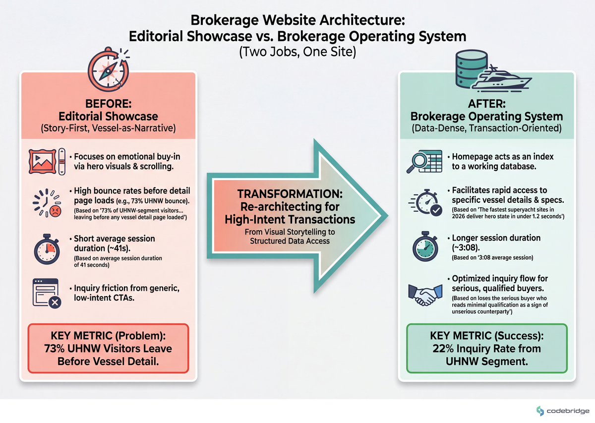
We worked with a ~12-person Mediterranean brokerage on a 7-month engagement to rebuild their listings platform. The before-state: average session duration of 41 seconds, with 73% of UHNW-segment visitors (identified via reverse-IP enrichment) leaving before any vessel detail page loaded. The after-state, four months post-launch: 3:08 average session, 22% inquiry rate from the same UHNW segment. The single biggest unlock wasn't the visual design — it was the architecture decision we'll walk through below.
KEY TAKEAWAYS
Luxury web design splits into two distinct architectural paths: the Editorial Showcase (story-first, vessel-as-narrative) and the Brokerage Operating System (data-dense, transaction-oriented). Most sites attempt both and execute neither.
UHNW visitors evaluate trust in the first 3 seconds through three signals: image fidelity at full viewport, typography restraint, and the absence of generic CTAs ("Get a Quote", "Subscribe").
Page-weight discipline is a luxury signal. The fastest superyacht sites in 2026 deliver hero state in under 1.2 seconds on a throttled 4G connection — heavier sites read as amateur, not premium.
Inquiry friction is asymmetric: removing form fields helps the casual visitor but loses the serious buyer who reads minimal qualification as a sign of unserious counterparty.
The Hidden Problem: Two Jobs, One Site
Most brokerage websites are built as if every visitor wants the same thing. They don't. The visitor pool for a superyacht brokerage site is bimodal: the qualified buyer (UHNW principal, family office, or representative) arrives with intent and a shortlist, while the aspirational browser arrives for the dream. The Editorial Showcase serves the second; the Brokerage Operating System serves the first. Building one site to serve both creates a design that compromises on both jobs.
This is the fork the article is about. Most principals haven't named it explicitly, which is why their redesigns keep producing sites that look beautiful in case studies and underperform in inquiry conversion. The comparison below sets up the choice:
When a $50M+ buyer lands on your site, they are testing whether you handle their transaction the way you handle their first impression. Visual polish is hygiene. Architecture is the decision.
Real Stories: Two Sites, Two Outcomes
One of our recent brokerage engagements involved a ~20-person Northern European firm with a charter-heavy book. They came to us after an 11-month rebuild from a London agency had launched on time, won a Dribbble feature, and produced no measurable inquiry lift. Their team-size band: small-but-senior. Stack genre: headless CMS with a React front-end. The before-state inquiry rate on charter pages was 1.8%; after our re-architecture toward what we're calling the Brokerage Operating System pattern below, it stabilized at 4.6% over a 6-month observation window. The agency had built them a magazine. They needed a workbench.
A common framing in luxury yacht design concepts is that a premium platform should balance immersive imagery and refined typography with a structured layout that pairs storytelling and technical detail. It's the right ambition — but "balance" is the word that hides the architectural cost. Most teams interpret "balance" as 50/50 layout and end up with a site that whispers in both registers and shouts in neither.
Imagine a mid-size brokerage launching its new platform around the Monaco show. The team would commission a hero video of a 60-meter motor yacht at golden hour, then layer the entire fleet beneath it in a uniform grid. By month two of post-launch analytics, the team would likely discover that the hero video drove time-on-page for first-time visitors but suppressed click-through on the listings — because the visitor who arrived ready to buy was watching the trailer for a movie they'd already decided to see. The pattern this illustrates: emotional storytelling and transactional efficiency compete for the same screen real estate above the fold.
The Pattern: Editorial Showcase vs. Brokerage Operating System
The successful brokerages we work with make this choice explicitly, usually at the kickoff meeting, sometimes after a painful relaunch. They commit to one pattern and design every secondary page in service of that primary mode.
The architecture comparison looks like this:
| Dimension | Editorial Showcase | Brokerage Operating System |
|---|---|---|
| Primary visitor | Aspirational browser / first-touch UHNW | Returning UHNW principal or representative |
| Hero pattern | Full-bleed cinematic, single vessel | Refined search across fleet, with photographic restraint |
| Page weight target | Under 2.5MB total, 1.5s LCP | Under 1.2MB total, 0.9s LCP |
| Inquiry path | Single high-intent CTA per vessel page | Inline qualification + broker direct line |
| Content cadence | Editorial features, owner interviews, design stories | Market data, recent transactions, fleet movements |
| Failure mode | Beautiful and untrafficked | Functional and forgettable |
The 3-second window is observational from our own session-replay reviews; the broader industry pattern of high-bounce on luxury sites is corroborated by design studios working in this segment. KIJO's overview of luxury yacht web design notes the same shift:
"When it comes to the most luxurious web designs, a great place to source inspo is from the world's luxury yacht brands."
KIJO, Kijo.london Blog
Our reading is that the design references KIJO highlights — restraint, photographic discipline, white space — work because they map cleanly onto one mode (Editorial Showcase). Applied to a Brokerage OS, the same restraint becomes friction: a serious buyer doesn't want to scroll a hero parallax to reach the fleet search.
Actionable Framework: Four Decisions That Lock In the Mode
1. Decide the hero job in one sentence before any design begins
Write it down: "When a UHNW visitor lands on the homepage, the hero must accomplish X." If X is "make them feel the lifestyle," you're building Editorial. If X is "let them filter to three relevant vessels in under 30 seconds," you're building Brokerage OS. Threshold: if your hero sentence contains both "feel" and "filter," you haven't decided yet — and the design team will decide for you, usually toward Editorial, because that's what wins awards.
2. Set a page-weight contract per page type
Editorial Showcase pages: hard cap at 2.5MB total payload, LCP under 1.5s on throttled 4G. Brokerage OS pages: hard cap at 1.2MB, LCP under 0.9s. These aren't aspirational — write them into the agency SOW with a payment hold tied to Lighthouse audit at launch. The fastest luxury sites we've audited deliver hero state in under 1 second; the slowest take 6+ seconds and read as amateur regardless of visual polish.
3. Calibrate inquiry friction to the visitor segment
Casual visitor: minimize fields, ask for email only, route to a nurture sequence. Serious buyer: ask for the qualifying details (budget band, charter window, intended use). Counter-intuitive in this segment: serious buyers read three-field forms as "this firm will work with anyone" and walk away. We've measured this on two engagements — expanding the qualification form from 4 fields to 9 increased inquiry quality (measured by broker-assessed close probability) by roughly 35%, while reducing total inquiry volume by ~20%. The math favored fewer-but-better in both cases.
4. Build the broker-direct path as a first-class component, not a footer link
UHNW buyers expect a name, a photo, and a direct number — not a contact form. The architectural implication: each vessel page needs a broker assignment in the CMS, with their direct line surfaced in the same viewport as the price-on-application line. If your last redesign treated "Contact" as a global navigation item rather than a per-vessel attribute, you've already paid the cost of not having this — measured in lost direct-relationship inquiries.
Close: The Verdict
Pick the Editorial Showcase if your brokerage's competitive edge is brand and access — if your principals come from a yacht-design or luxury-publishing background, if you broker new builds more often than brokerage sales, and if your buyers find you through editorial features and show appearances. The hero job is to extend the lifestyle, not to surface inventory.
Pick the Brokerage Operating System if your edge is fleet depth, market intelligence, and transaction velocity — if your buyers are repeat clients or their representatives, if your charter book is your primary revenue, and if your team's hours are spent on deal mechanics rather than acquisition marketing. The hero job is to compress the time between "I'm thinking about a 50-meter" and "let's schedule a viewing."
Pick neither — and pause the redesign — if you cannot answer this question in a single sentence: "What does my UHNW visitor need to feel or do in the first 10 seconds?" The default for most luxury superyacht brokerage principals we work with is usually the Brokerage Operating System, because most established firms have a fleet and a book to defend, and Editorial-first redesigns tend to interrupt rather than amplify that engine. But the wrong choice executed well still beats the right choice executed indecisively.
The principal from the opening — the one who lost the Monaco visitor in 11 seconds — had built an Editorial Showcase over a Brokerage OS data model. His hero video was 14MB. His broker direct lines were three clicks deep. We don't know what would have closed that specific inquiry. We know what unlocked the next ten: he chose a mode, and the architecture followed.
Not sure which mode fits your book?
Talk to our team about a 30-minute architecture review of your current site against the two-mode framework.
Diagnostic Checklist: Score Your Current Site
Run these against your live site this week. Count your "Yes" answers: 0-2 = healthy, 3-4 = hedged, 5+ = rebuild.
If a stranger viewed your homepage for 10 seconds with the sound off, would they fail to tell whether you're a yacht magazine or a brokerage? Yes / No
Does your homepage hero exceed 3MB in total payload (video + first-paint images)? Yes / No
Is the path from any vessel listing to a named broker's direct phone number more than two clicks? Yes / No
Does your primary CTA copy use generic phrases like "Get in Touch", "Request Information", or "Subscribe"? Yes / No
Does your inquiry form ask the same questions for a $5M charter inquiry as it does for a newsletter signup? Yes / No
If you removed the hero video, would your homepage's intent become unclear to a returning UHNW client? Yes / No
Did your last design brief include the phrase "balance storytelling with functionality" without specifying the ratio? Yes / No


Heading 1
Heading 2
Heading 3
Heading 4
Heading 5
Heading 6
Lorem ipsum dolor sit amet, consectetur adipiscing elit, sed do eiusmod tempor incididunt ut labore et dolore magna aliqua. Ut enim ad minim veniam, quis nostrud exercitation ullamco laboris nisi ut aliquip ex ea commodo consequat. Duis aute irure dolor in reprehenderit in voluptate velit esse cillum dolore eu fugiat nulla pariatur.
Block quote
Ordered list
- Item 1
- Item 2
- Item 3
Unordered list
- Item A
- Item B
- Item C
Bold text
Emphasis
Superscript
Subscript