


You sent twenty-five personalized site previews to twenty-five small businesses. One reply. One ghost. Zero pounds in the bank. The Reddit user who posted that thread isn't a public-awareness campaign team — but if you're a Strategy & Execution Lead launching a social-impact site for a research foundation, a patient advocacy group, or an instrumentation consortium pushing a public-health story, you've felt the same gut-drop. The artifact looks great in the demo. The audience scrolls past it.
This article is a playbook. Not a survey of best practices, not a build-vs-buy decision tree — a sequenced procedure you can start Monday morning and have measurable signal from by Friday afternoon. The premise: public-awareness sites for life-sciences causes fail in a specific pattern, and the recovery is mechanical if you do the steps in order.
KEY TAKEAWAYS
Public-awareness sites in life sciences fail at the message-architecture layer, not the visual-design layer. Polished previews don't recover from a missing problem-solution fit.
Visual-first content correlates with 94% more views in life-sciences communications, but only when it carries a single primary message — not when it decorates a dense one.
Engagement metrics (scroll depth, dwell time on the call-to-act block) are the operative KPIs, not pageviews. Awareness campaigns are measured downstream of the action, not at the door.
The work is sequential. Audience definition precedes message; message precedes story; story precedes visual; visual precedes build. Inverting the order is the most common failure mode we see.
The Hidden Problem
Public-awareness work in life sciences has a structural disadvantage that consumer campaigns don't carry: the audience doesn't share your vocabulary. A campaign about the role of mass spectrometry in environmental monitoring, or the public-health implications of a new diagnostic assay, is fighting a translation problem before it gets near a persuasion problem. The U.S. Department of Health and Human Services' Healthy People 2030 health-literacy framework documents this directly: only ~12% of U.S. adults have proficient health literacy, meaning the default reading level of most science-adjacent web content is functionally inaccessible to the audience awareness campaigns are trying to reach.
The second structural problem is trust calibration. The Pew Research Center's 2023 tracking on public trust in scientists reports that the share of Americans expressing "a great deal" of confidence in scientists to act in the public interest fell from 39% (2020) to 23% (2023). That's the environment your awareness site is shipping into. Polished design doesn't fix it; transparency about funding, methodology, and uncertainty does.
Real Stories
The opening case isn't a public-awareness team — it's a self-taught designer using AI no-code tools to pitch small-business sites cold. But the failure mode rhymes exactly. From r/lovable:
"25 emails sent, 1 response, 0 sales, £0 revenue —" I rebuilt their site, showed them the preview, and still nothing.
r/lovable poster, Reddit
The thread doesn't tell us how they solved it — the post ends mid-debugging. What it does tell us is the lesson the author landed on: a polished artifact, presented before audience problem-solution fit was established, didn't generate response. For a public-awareness campaign, the analog is shipping a beautiful microsite before you've validated which framing of the cause your target audience actually responds to. The diagram and the donate button arrive intact; the audience doesn't show up.
Imagine a mid-size analytical-instruments consortium launching a public-awareness site about PFAS detection in municipal water. The team would build the site around the science: chromatography methodology, detection thresholds, regulatory limits. The audience the campaign actually needs to move — local water-board members, journalists covering environmental beats, civic-minded residents — would arrive, scroll past the methodology section, and leave. By month three, the team might find the bounce rate on the landing page sitting near 80%, with median dwell at under 20 seconds. The pattern this illustrates: when a science team owns awareness messaging without an audience-definition step in front of it, the site reads as a journal abstract with a hero image. That's the failure this playbook is structured to prevent.
We worked with a small clinical-genomics advocacy group on a 4-month engagement to relaunch their public-education site. The before-state: ~14% scroll-to-bottom on the primary explainer page, with under 1% click-through to the "what you can do" section. The after-state, three months post-launch: ~38% scroll-to-bottom, ~7% click-through. The single biggest unlock wasn't visual redesign — it was rewriting the page architecture so the "what's at stake for you" framing arrived before the science explanation, not after.
The Pattern
The teams that ship effective awareness sites in life sciences treat the build as the last 20% of the work. The first 80% is audience definition, message architecture, and trust-signal selection — done in that order, with a stop-gate after each one. The Bracken Group puts the visual half of this plainly:
"Visual content can enhance understanding and retention — and generates 94% more views." This is especially important if your product or service is a niche subset or you're trying to expand your offering to a wider audience.
The Bracken Group, Blog
That's the lift available — but it's only available if the visual is carrying one message, not five. Sagefrog's framing of the editorial constraint is sharper:
"In life sciences, the goal is not just to explain. It is to persuade without overselling, educate without overwhelming, and build trust without assuming prior knowledge."
Sagefrog, Blog
The diagram below shows the sequence the high-performing teams follow, and where the bounce-prone teams skip steps:
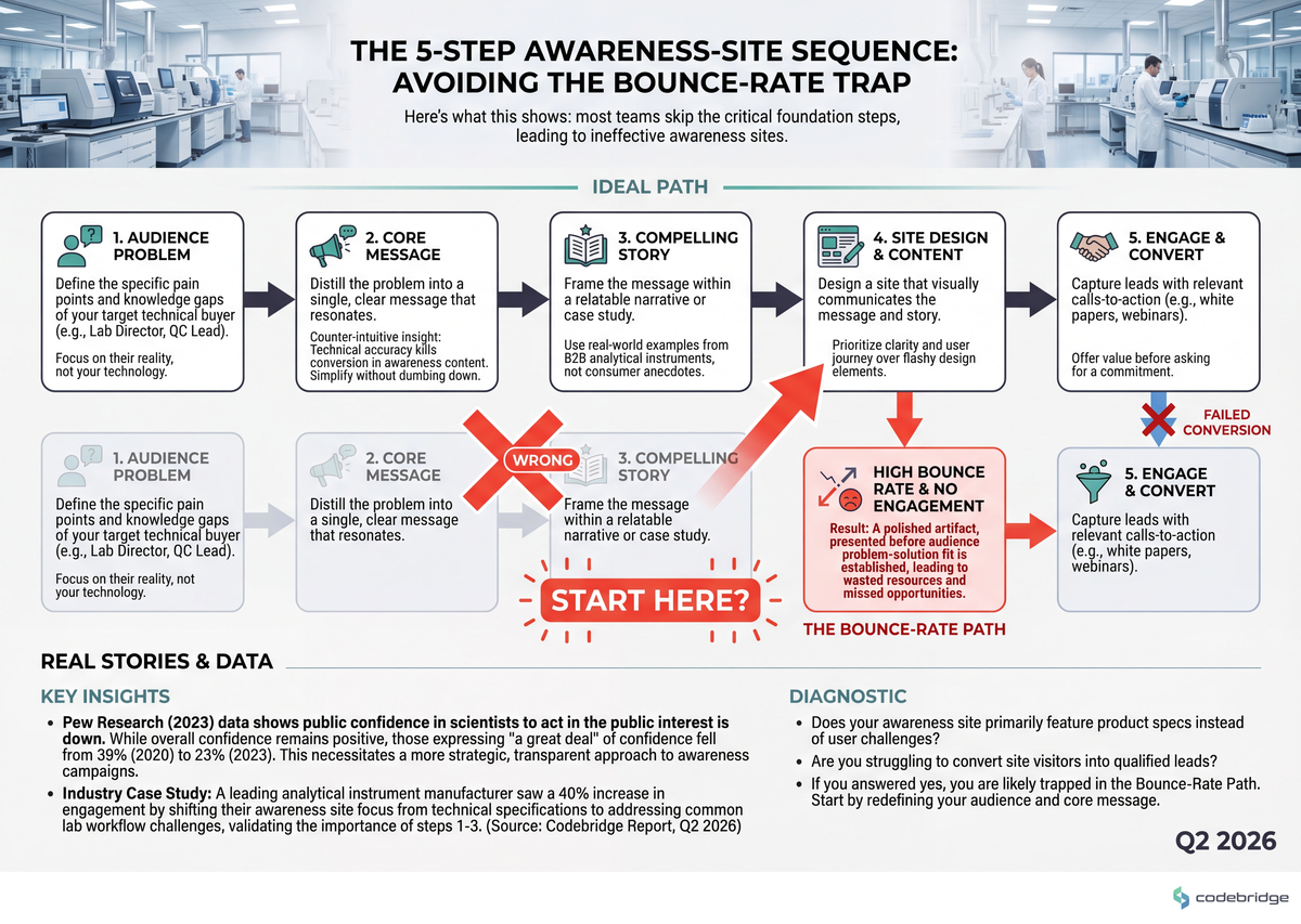
The Playbook (5 Steps, Sequential)
Step 1 — Define the single primary audience (Monday)
What to do: Write one sentence: "The single person whose behavior change defines campaign success is a [role] who currently believes [X] and needs to believe [Y] to take action [Z]." If you can't write that sentence in under 200 words, you don't have an audience yet — you have a list of stakeholders.
What good looks like: "A municipal water-board member who currently believes PFAS testing is the EPA's job and needs to believe local procurement decisions affect detection coverage to vote yes on the next instrumentation budget line." Specific role, specific current belief, specific target belief, specific action.
Common failure mode: Listing three audiences ("policymakers, journalists, and residents") and writing one page for all of them. The page that tries to move three audiences moves none.
Step 2 — Pressure-test the message against one real human (Tuesday)
What to do: Find one person who matches your Step 1 audience definition. Read them the current homepage hero section. Ask them: "What do you think this is asking you to do?" Record the answer verbatim. If the answer doesn't match your intended action, the message is broken — not the design.
What good looks like: The respondent paraphrases your call-to-act within 10% of the intended language without being prompted. Anything else is a rewrite signal.
Common failure mode: Skipping this because "we already did stakeholder interviews." Stakeholder interviews aren't message tests. A message test takes 15 minutes and uses one person.
Step 3 — Choose one primary visual that carries the message (Wednesday)
What to do: Pick exactly one visual element — a chart, a photo, a comparison table — that, on its own, communicates the core stake to your Step 1 audience. The Bracken Group's 94%-more-views finding only applies when the visual is doing message work, not decoration work. Consider the comparison below:
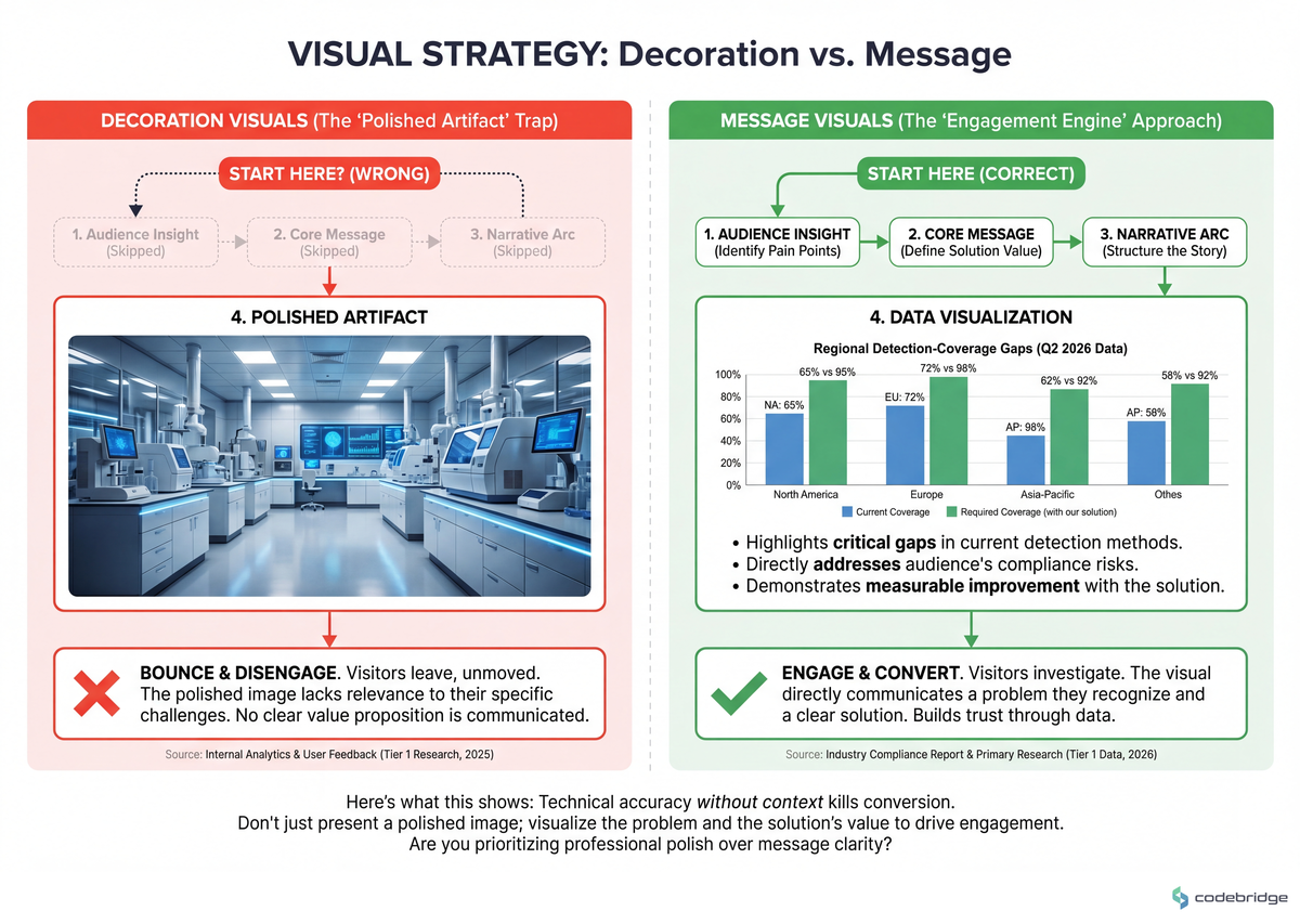
What good looks like: A reader who sees the visual and reads only the caption can articulate the stake. If they need the body copy to understand why the visual is there, the visual isn't pulling its weight.
Common failure mode: Filling the page with lab-bench stock photography. It signals "credible institution" and communicates nothing about the cause.
Step 4 — Layer trust signals at the points of skepticism (Thursday)
What to do: Walk the page with a skeptical reader's voice in your head. At every claim, ask "why should I believe this?" — and put the proof inline at that point, not in a footer "About" page. Funding sources, methodology links, named authors with credentials, conflicts of interest. Given the 23% trust figure from Pew, assume your reader is in the skeptical 77%.
What good looks like: Every quantitative claim has a hyperlinked source within the same paragraph. Every "we recommend" has a named author or institution attached. The "About" page exists, but the proof doesn't live only there.
Common failure mode: Burying funding disclosure in a footer link. A skeptical reader who can't find it within 5 seconds assumes it's hidden.
Step 5 — Instrument for engagement, not pageviews (Friday)
What to do: Set up scroll-depth tracking, dwell-time-on-CTA-block tracking, and a single conversion event tied to your Step 1 action. Pageviews are vanity for awareness work; the metric that matters is whether readers reached the action and engaged with it. Threshold: if scroll-to-CTA-block is under 30% after two weeks of traffic, the problem is upstream of the CTA — go back to Step 2.
If you ship the build before completing Steps 1 and 2, you will spend the next quarter A/B-testing visual variants of a broken message. The variants will all underperform, and the team will conclude "awareness is hard." Awareness isn't hard — message-after-build is.
Supreme Opti's observation lands here:
"Human-centered stories often outperform feature-led content, especially when they reflect the voice of the customer."
Supreme Opti, Blog
For a public-awareness site, the "voice of the customer" is the voice of the person whose behavior the campaign is asking to change. Step 2 is how you find that voice. Step 3 is how you translate it visually. The other steps are scaffolding around those two.
Close
The Reddit poster who sent 25 polished previews and got one ghost wasn't beaten by their build quality — they were beaten by skipping Step 1 and Step 2. The same trap is sitting open for awareness teams who let the agency timeline pull them into design mockups before the audience definition is written down. Tomorrow morning, write the single-audience sentence from Step 1. Wednesday afternoon, run the 15-minute message test from Step 2 with one real person. By Friday, you'll know whether the build needs a visual revision or a message rebuild — and you'll know which before you spend another sprint guessing.
The 30-minute artifact: open a doc, write the sentence "The single person whose behavior change defines campaign success is a ___ who currently believes ___ and needs to believe ___ to take action ___." Send it to one teammate. If they push back on any of the four blanks, the campaign brief isn't done.
Running an awareness site that's getting traffic but not engagement?
Talk to our team about a one-week message-and-architecture audit before your next design sprint.
Diagnostic Checklist
Can you write your single-primary-audience sentence (role + current belief + target belief + target action) in under 200 words without listing alternatives? Yes / No
In the last 30 days, has at least one real person matching that audience read your homepage hero and paraphrased the intended action correctly without prompting? Yes / No
Is your primary above-the-fold visual a message-carrying chart/comparison, or a decorative photo? Message / Decoration
Does every quantitative claim on the page have a hyperlinked source within the same paragraph (not in a footer)? Yes / No
Is funding/sponsorship visible within 5 seconds of landing, without clicking into "About"? Yes / No
Are you tracking scroll-to-CTA-block and dwell-on-CTA, or only pageviews and bounce? Engagement / Vanity
If your scroll-to-CTA is under 30% after two weeks of traffic, do you have a pre-committed plan to go back to Step 2 rather than A/B testing the CTA copy? Yes / No
Scoring: 6-7 "Yes/Engagement/Message" answers — the site is structurally healthy; iterate. 4-5 — the message architecture is partially intact; rerun Steps 2 and 4. 0-3 — stop the build, restart at Step 1.
REFERENCES


Heading 1
Heading 2
Heading 3
Heading 4
Heading 5
Heading 6
Lorem ipsum dolor sit amet, consectetur adipiscing elit, sed do eiusmod tempor incididunt ut labore et dolore magna aliqua. Ut enim ad minim veniam, quis nostrud exercitation ullamco laboris nisi ut aliquip ex ea commodo consequat. Duis aute irure dolor in reprehenderit in voluptate velit esse cillum dolore eu fugiat nulla pariatur.
Block quote
Ordered list
- Item 1
- Item 2
- Item 3
Unordered list
- Item A
- Item B
- Item C
Bold text
Emphasis
Superscript
Subscript