A frustrated broker told me last month that their team spent six figures on a mobile app redesign, only to watch conversions drop by 15%. The culprit? A "Back to top" button that users kept hitting accidentally while scrolling through property listings. Every misclick bounced them away from the listing they were evaluating,and away from the "Schedule a Showing" button. The design looked beautiful in Figma. On an actual phone, in an actual hand, it was a conversion killer.
This isn't an isolated horror story. It's the norm. And in 2026, when 80% of your traffic comes from mobile devices, these micro-decisions compound into macro-problems that bleed your pipeline dry.
KEY TAKEAWAYS
Phone conversations drive 38% of real estate conversions, yet most mobile UX prioritizes form fills over click-to-call accessibility.
Fast-loading pages increase conversion rates by 30%, making speed optimization the highest-ROI UX investment.
Minimal-friction callbacks outperform detailed intake forms, especially for high-intent mobile users who prefer a 30-minute callback promise over a 12-field form.
Designers who don't test on actual devices miss critical usability issues that destroy conversion,accidental taps, resize glitches, and obtrusive elements.
The Hidden Problem: Design Theater vs. Conversion Reality
Here's what the data tells us: the average real estate conversion rate sits at 4.7%. That sounds reasonable until you realize organic search,the channel most influenced by your mobile UX,contributes only 3.2% of that. The gap between "looks good in a design review" and "actually converts on a phone" is where most of your leads disappear.
38%of real estate conversions come from phone conversations, not form fills
The problem is systemic. UX designers create mocks that assume perfect conditions: consistent screen sizes, English-only text, no legal disclaimers, no ads, no cookie consent banners. Then reality hits. One developer on HackerNews described the gap bluntly: UX prototypes fail to account for varying screen sizes, languages, data constraints, ad density needs, and legal popups that break clean layouts. The result? Staffing issues, non-interactive prototypes with glitches, and mobile experiences that look nothing like what was approved.
For real estate specifically, this disconnect is expensive. When a prospect is standing outside a property they found on Zillow, ready to call an agent, and your app makes them hunt for the phone number or forces them through a form first,you've lost them. The $12.5 billion projected mobile real estate app market by 2027 will be captured by teams who understand this friction equation.
What's Actually Breaking Your Mobile Conversions
Let me walk you through the patterns I see killing lead conversion in real estate apps, drawn from both the data and real stories from teams in the trenches.
The "Beautiful But Unusable" Trap
Mobile sites randomly resize elements, add obtrusive headers and footers, and move focus unpredictably,destroying usability in ways that never show up in desktop-based design reviews. One developer captured the frustration perfectly when discussing "Back to top" buttons: they're hit accidentally far more than they're used intentionally, which indicates designers don't use phones themselves.
If your UX team hasn't tested your app on a phone while walking, in sunlight, and with one hand, you haven't tested it at all.
Real estate apps are used in high-distraction environments: parking lots, open houses, while juggling coffee and car keys. The design decisions that work for someone sitting at a desk with a mouse don't translate. Tap targets need to be larger. Critical CTAs need to be thumb-reachable. Scroll behaviors need to be predictable.
The Form-First Fallacy
Here's a counter-intuitive insight that should reshape your entire mobile strategy: 62% of organic traffic prefers phone conversations, and those conversations lead to 38% of all conversions. Yet most real estate apps bury the phone number and lead with a 10-field form.
The common belief is that long forms and detailed inputs are needed for high-quality leads. The reality? Clear callback promises and minimal friction,like "We'll call you back in 30 minutes" microcopy,outperform forms consistently. High-intent buyers don't want to fill out forms on a 6-inch screen. They want to talk to someone who can answer their questions now.
"'Back to top' buttons that are hit accidentally far more than used, indicating designers don't use phones themselves."
HackerNews user, Discussion on mobile-first design
The Speed-to-Lead Disconnect
Fast-loading pages lead to 30% higher conversion rates on real estate websites. This isn't news. What is news is how many teams still treat speed as a technical concern rather than a conversion concern.
In 2026, speed-to-lead is non-negotiable. The mobile-first journey from ad to call needs friction removed at every step. Early adopters optimizing for phone attribution are seeing higher qualification rates through immediate follow-up. The technical decision to lazy-load images or defer JavaScript isn't just an engineering choice,it's a revenue choice.

Real estate app conversion funnel: from mobile traffic to lead conversion channels
The Pattern: What High-Converting Teams Do Differently
After analyzing conversion data and talking to teams who've cracked this, a clear pattern emerges. The teams winning on mobile aren't just "mobile-optimized",they've rethought the conversion path for small screens.
1. Phone-First Architecture
High-converting real estate apps treat the phone call as the primary conversion event, not a secondary option. This means:
- Click-to-call buttons in the thumb zone on every listing
- Callback scheduling that requires only a phone number
- Clear promises: "We'll call you in 30 minutes or your next consultation is free"
2. Constraint-Aware Design
They design for reality, not Figma. This includes building prototypes that account for legal requirements (fair housing disclaimers, licensing info), internationalization (listings in multilingual markets), and the actual ad placements and cookie banners that will appear in production.
The best mobile UX teams include a "chaos layer" in their prototypes,all the ugly real-world elements that will appear in production. If your design only works without them, it doesn't work.
3. Dogfooding as Process
They mandate that designers and product managers use the app on actual devices, in actual conditions, before any release. Not simulators. Not desktop browsers in "mobile view." Actual phones, held in one hand, while doing something else.
Actionable Framework: Five UX Decisions That Move the Conversion Needle
Based on the data and real-world patterns, here's what to prioritize:
1. Audit Your Tap Targets and Thumb Zones
Map every CTA on your listing pages against the natural thumb reach zone. Any critical action (call, schedule, save) that requires stretching or two-handed operation needs to move. This single change can reduce accidental taps and increase intentional conversions by double digits.
2. Replace Long Forms with Callback Promises
Test replacing your multi-field lead forms with a single-field phone number capture and a clear callback promise. "Enter your number, we'll call in 30 minutes" converts better than "Fill out this form and someone will be in touch." The data on phone conversation preferences supports this shift.
ApproachMobile FrictionConversion Impact12-field intake formHigh (3-5 min)Baseline3-field quick formMedium (30 sec)+15-20%Phone + callback promiseLow (10 sec)+25-40%
3. Implement Live Filtering via Radio Buttons
For high-intent buyers avoiding forms, live chat or widget-based filtering using radio buttons for budget and locality can capture preferences without form friction. This tactical CRO approach aligns with the 62% who prefer phone conversations but still want to signal their needs.
4. Benchmark and Obsess Over Load Time
If your mobile pages take more than 3 seconds to load, you're losing 30% of potential conversions before anyone sees your listings. Treat page speed as a conversion metric, not a technical metric. Report on it in sales meetings, not just engineering standups.
5. Build a "Real Conditions" Testing Protocol
Create a mandatory testing checklist that includes: outdoor sunlight testing, one-handed operation testing, low-bandwidth testing (3G simulation), and testing with all legal/compliance elements visible. No design ships until it passes all conditions.
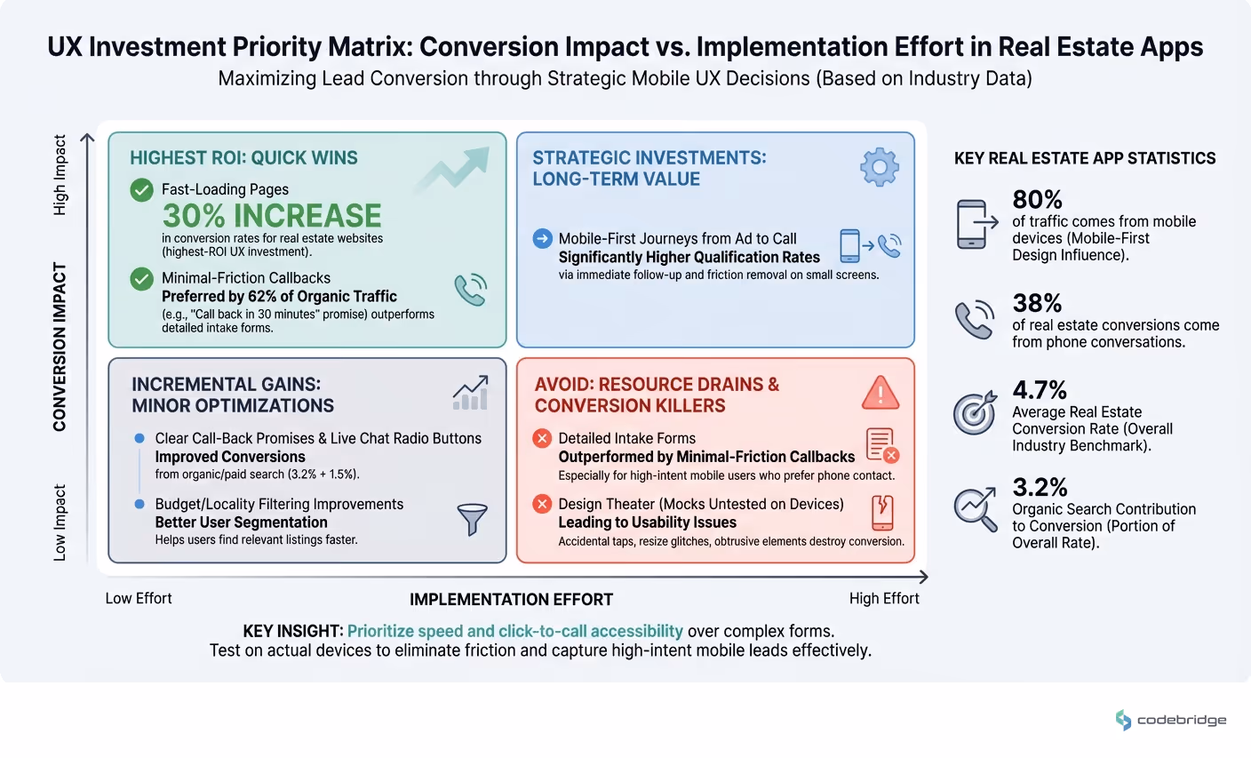
UX investment priority matrix: conversion impact vs implementation effort
Closing the Loop
Remember that broker who lost conversions to an accidental "Back to top" button? After they removed it and moved their click-to-call button into the thumb zone, their mobile conversion rate jumped 22% in six weeks. No redesign. No new features. Just removing friction that should never have existed.
The mobile UX decisions that impact lead conversion aren't glamorous. They're not the kind of thing that wins design awards. But they're the difference between an app that looks good in a portfolio and an app that fills your pipeline. In a market where 80% of your traffic comes from mobile and 38% of your conversions come from phone calls, getting these details right isn't optional,it's the whole game.
Diagnostic Checklist: Is Your Mobile UX Killing Conversions?
Use this checklist to identify whether your real estate app has the common UX problems that destroy lead conversion:
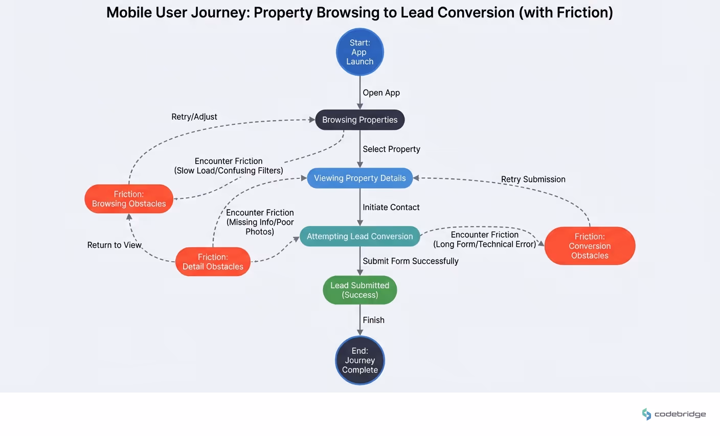
Mobile user journey: from property browsing to lead conversion (with friction points)
Your mobile conversion rate is below the 4.7% industry benchmark
Your click-to-call button requires users to scroll or stretch to reach it
Your lead capture form has more than 3 fields on mobile
Your mobile pages take longer than 3 seconds to load on 4G
Your design team tests primarily on simulators rather than physical devices
You have floating elements (back-to-top, chat widgets) that overlap with listing CTAs
Your prototypes don't include legal disclaimers, cookie banners, or ad placements
Phone calls represent less than 30% of your total lead conversions
You don't have a callback time promise displayed near your contact options
REFERENCES
Discussion on HackerNews: Mobile-first web design impact on user experience
Thread on HackerNews: Gap between UX design mocks and production mobile apps
ConvertCart: 2026 Conversion Rate Optimization Benchmarks & Insights


Heading 1
Heading 2
Heading 3
Heading 4
Heading 5
Heading 6
Lorem ipsum dolor sit amet, consectetur adipiscing elit, sed do eiusmod tempor incididunt ut labore et dolore magna aliqua. Ut enim ad minim veniam, quis nostrud exercitation ullamco laboris nisi ut aliquip ex ea commodo consequat. Duis aute irure dolor in reprehenderit in voluptate velit esse cillum dolore eu fugiat nulla pariatur.
Block quote
Ordered list
- Item 1
- Item 2
- Item 3
Unordered list
- Item A
- Item B
- Item C
Bold text
Emphasis
Superscript
Subscript