When Your App "Feels Slow," You're Already Losing Leads
A real estate platform team discovered something painful last year: their high-resolution property photos were killing load times. Users were dropping off before they ever saw a single listing. The fix took their page load from 4.2 seconds to 1.1 seconds,and here's what surprised them most. Users reported the app "felt faster" even though the actual feature set didn't change. That perception shift yielded 44% more page views and cut bounce rate from 52% to 31%.
This isn't a story about image compression. It's about how mobile UX decisions compound into conversion outcomes that most real estate teams never trace back to their root cause.
KEY TAKEAWAYS
Speed is conversion currency,fast-loading pages drive 30% higher conversion rates in real estate.
Complex filtering kills engagement,89% of users only touch 3 filters, yet most apps ship with 15+.
Phone beats forms,62% of organic traffic prefers phone conversations, leading to 38% of conversions.
Context data multiplies qualified leads,neighborhood information increases qualified leads by 43%.
Data transparency builds trust,simple "last updated" timestamps reduce support tickets by 40%.
The Hidden Problem: You're Optimizing the Wrong Things
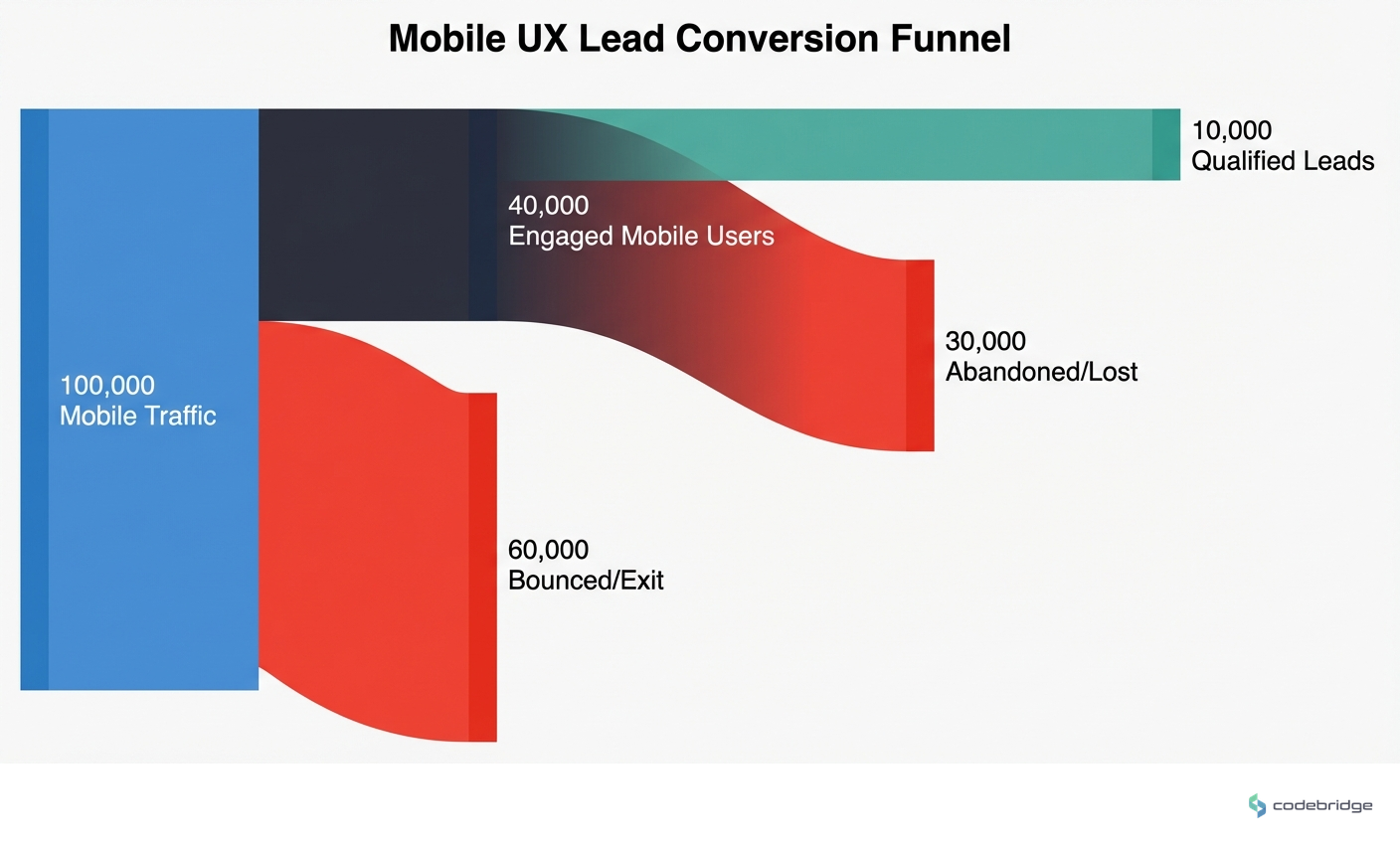
The real estate industry averages a 4.7% conversion rate,and most teams assume their mobile app is performing somewhere in that range. But here's what the data actually shows: organic search contributes just 3.2% of that overall conversion rate. The gap between "traffic" and "qualified leads" is where mobile UX decisions either compound your advantage or silently bleed opportunity.
With the market heading toward $12.5 billion in mobile app revenue by 2027, the stakes for getting mobile UX right have never been higher. Yet most teams are still building features based on assumptions rather than actual user behavior,and the conversion cost is substantial.
The Feature Complexity Trap
One app team learned this the hard way when they launched with an elaborate filtering system. They'd spent months building it. Users hated it. Session recordings revealed that 89% of users only touched three filters: price, location, and bedrooms. Everything else was noise.
"We launched with a complex filtering system that users hated." This single change increased property views per session from 4.2 to 8.7.
u/startupfounder, Reddit r/startups
The fix wasn't removing features,it was implementing smart defaults based on those three most-used filters. The result doubled engagement. This pattern repeats across real estate apps: teams build for edge cases while ignoring the core journey that 90% of users actually take.
Context Is the Conversion Multiplier
Another team discovered that users didn't just want to see houses,they wanted to understand neighborhoods. Crime stats, school ratings, transit access. Integrating five different data sources was painful, but the UX payoff was massive: qualified leads increased by 43%, and users spent 67% more time per property listing.
When users can make better decisions inside your app, they convert at higher rates,because they're self-qualifying before they ever contact you.
This insight flips the traditional lead-gen mindset. Instead of capturing as many leads as possible and qualifying later, contextual data lets users qualify themselves. The leads you do get are higher intent, which means your sales team spends less time on dead ends.
The Pattern: What High-Converting Teams Do Differently
Across the teams seeing above-benchmark conversion rates, three patterns emerge consistently:
1. They Obsess Over Perceived Speed
Not just actual load times,perceived speed. Fast-loading pages drive 30% higher conversion rates, but the perception of speed matters as much as the milliseconds. Skeleton screens, progressive image loading, and instant feedback on user actions all contribute to an app that "feels" fast even when network conditions aren't ideal.
2. They Default to Phone, Not Forms
Here's a counter-intuitive finding: long forms aren't necessary for lead qualification. 62% of organic traffic prefers phone conversations, and those phone leads drive 38% of conversions. Clear call-back promises ("We'll call you within 30 minutes") and live chat radio buttons convert better than elaborate form fields by reducing friction at the moment of highest intent.
3. They Build for Retention, Not Just Acquisition
One team surveyed 500+ users and found that 73% wanted side-by-side property comparison. Implementing saved searches with email alerts reduced app churn by 18% and increased daily active users by 31%. The insight: real estate decisions take time, and apps that support the full decision journey,not just the initial search,capture more conversions.
"73% wanted to compare properties side-by-side." Implementing saved searches with email alerts reduced app churn by 18% and increased daily active users by 31%.
u/uxresearcher, Reddit r/UXDesign
The Trust Layer Most Apps Miss
Data freshness might seem like a backend concern, but it's actually a UX problem. One platform struggled with outdated listings damaging user trust and generating support tickets. The fix was surprisingly simple: showing "last updated" timestamps reduced support tickets by 40%.
Users don't expect perfect data,they expect transparency about data quality. A timestamp is a trust signal.
Combined with 15-minute cache invalidation, this small UX element reduced friction. Users stopped wondering if listings were current because the app told them explicitly.
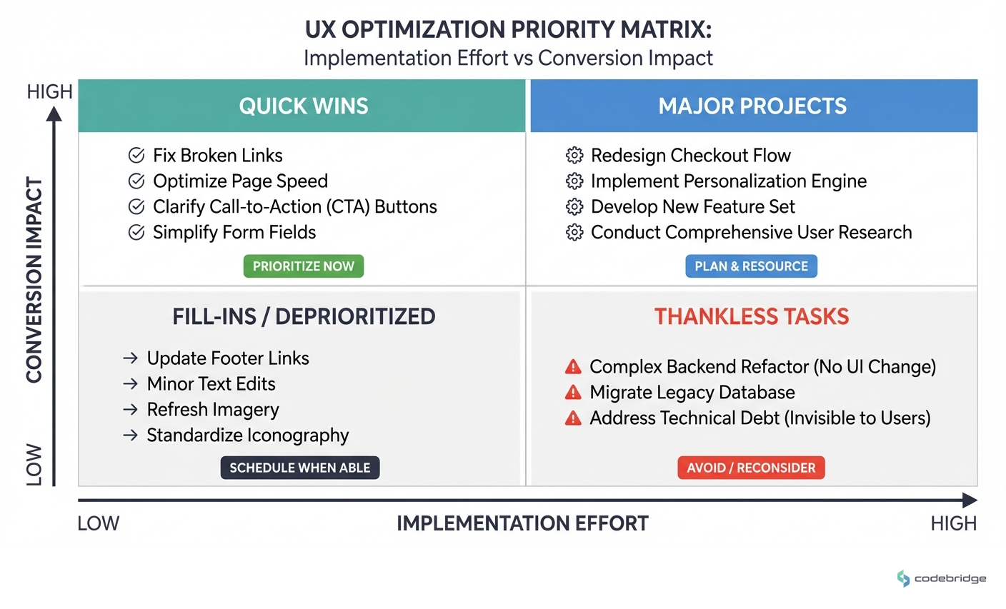
A Framework for Mobile UX Decisions That Convert
Based on what's working in 2026, here's a practical framework for evaluating mobile UX decisions through a conversion lens:
| Decision Area | Low-Converting Approach | High-Converting Approach |
|---|---|---|
| Load Performance | Optimize for feature completeness | Optimize for perceived speed first |
| Lead Capture | Long forms for qualification | Call-back promises + live chat options |
| Filtering | Maximum options for flexibility | Smart defaults based on actual usage |
| Property Data | House details only | Neighborhood context integrated |
| Data Freshness | Silent background updates | Visible timestamps + transparency |
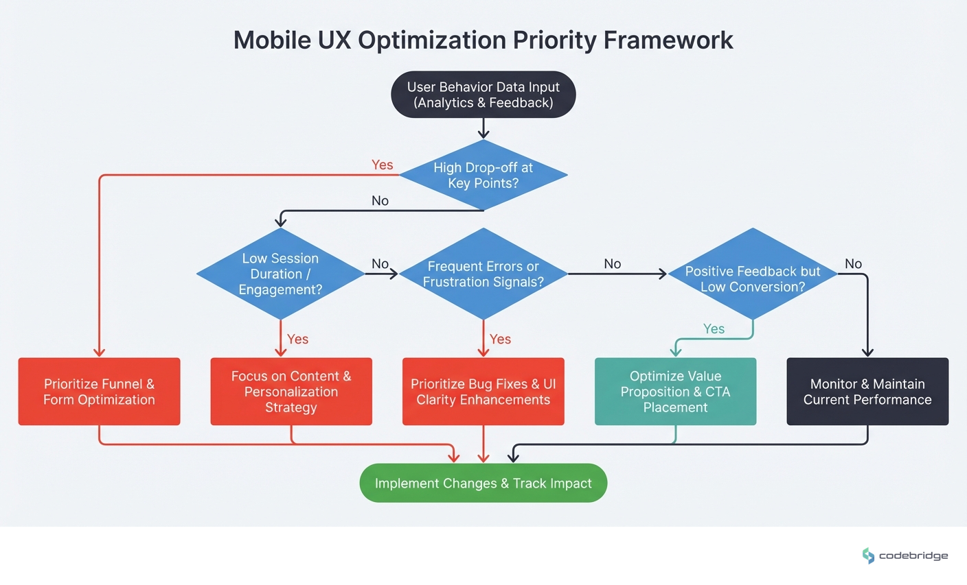
Step 1: Audit Your Actual User Behavior
Before building anything new, instrument your app to understand what users actually do. Session recordings and filter usage analytics will likely reveal that most of your features go untouched while a few core paths drive all engagement.
Step 2: Measure Perceived Speed, Not Just Load Time
Run user tests asking people to rate how fast your app feels. Compare this to actual performance metrics. The gap between perception and reality is where UX improvements have the highest ROI.
Step 3: Reduce Friction at Peak Intent Moments
Map your user journey and identify the moments when intent is highest,usually when viewing a specific property or after comparing options. Make the path to contact frictionless at these points. A phone number with a clear call-back promise often outperforms a form.
Step 4: Add Context That Enables Self-Qualification
Neighborhood data, school ratings, and transit information aren't just nice-to-haves,they're qualification tools. Users who can evaluate fit before contacting you are higher-quality leads.
Step 5: Build for the Full Decision Timeline
Real estate decisions take weeks or months. Saved searches with alerts, comparison tools, and persistent favorites keep users engaged through the full journey instead of losing them to competitors.
Closing the Loop
Remember that team with the 4.2-second load time? Their fix wasn't just technical,it was a mindset shift. They stopped asking "what features should we add?" and started asking "what friction should we remove?" The 3-second improvement in load time was the visible change. The invisible change was a team that now measures every UX decision against conversion impact.
The real estate apps winning in 2026 aren't the ones with the most features. They're the ones that load fast, feel responsive, and make the path from "browsing" to "contacting an agent" as frictionless as possible. Every UX decision either compounds that advantage or works against it.
Not sure where your mobile UX is leaking leads?
Start with a conversion audit of your highest-traffic user paths.
Diagnostic Checklist: Is Your Mobile UX Costing You Leads?
Your mobile page load time exceeds 2 seconds on 4G connections
Your conversion rate is below the 4.7% industry benchmark
Your property filter system has more than 5 options visible by default
Your lead capture form has more than 4 fields
You don't display "last updated" timestamps on property listings
Users can't save searches or set up alerts without creating an account
Your listings lack neighborhood context (schools, transit, crime data)
You don't offer a clear phone callback option alongside form submission
Your property comparison feature requires more than 2 taps to access
REFERENCES


Heading 1
Heading 2
Heading 3
Heading 4
Heading 5
Heading 6
Lorem ipsum dolor sit amet, consectetur adipiscing elit, sed do eiusmod tempor incididunt ut labore et dolore magna aliqua. Ut enim ad minim veniam, quis nostrud exercitation ullamco laboris nisi ut aliquip ex ea commodo consequat. Duis aute irure dolor in reprehenderit in voluptate velit esse cillum dolore eu fugiat nulla pariatur.
Block quote
Ordered list
- Item 1
- Item 2
- Item 3
Unordered list
- Item A
- Item B
- Item C
Bold text
Emphasis
Superscript
Subscript