


Mobile App UX Patterns That Drive Property Search Conversion in 2026
Last quarter, I watched our mobile conversion rate flatline at 2.1% while desktop hummed along at nearly 5%. We'd invested six figures in the app redesign. Leadership wanted answers. I spent three weeks buried in session recordings, and what I found changed how I think about property search UX entirely: our users weren't bouncing because of bad design. They were bouncing because we'd optimized for the wrong moments.
If you're running sales ops for a proptech platform in 2026, you've likely felt this same frustration. The gap between mobile and desktop conversion isn't a bug,it's a symptom of deeper UX debt that most teams don't know how to diagnose.
KEY TAKEAWAYS
Mobile converts at half the rate of desktop, yet 75% of rental searches happen on mobile devices,your biggest opportunity is your biggest gap.
Phone interactions drive 38% of real estate conversions, meaning tap-to-call placement matters more than form optimization.
Top performers like Zillow exceed 5% CVR by treating mobile UX as a conversion system, not a responsive afterthought.
SEO-driven leads cost 90% less than ILS, but only when mobile UX supports the organic discovery journey.
The Mobile Conversion Gap Nobody Talks About
Here's the uncomfortable truth: mobile conversion rates in real estate sit at 2.49% compared to desktop's 5.06%. That's not a rounding error,it's a 50% performance penalty for the channel where most of your users actually live.
According to Apartments.com data via CallRail, three-quarters of rental searches now happen on mobile. We're spending the majority of our acquisition budget driving users to an experience that converts at half the rate of the minority channel. The math doesn't math.
What makes this systemic rather than isolated? The industry-wide conversion rate hovers around 2.2%, which means most teams have normalized underperformance. When everyone's struggling, it stops feeling like a problem and starts feeling like "just how mobile works."
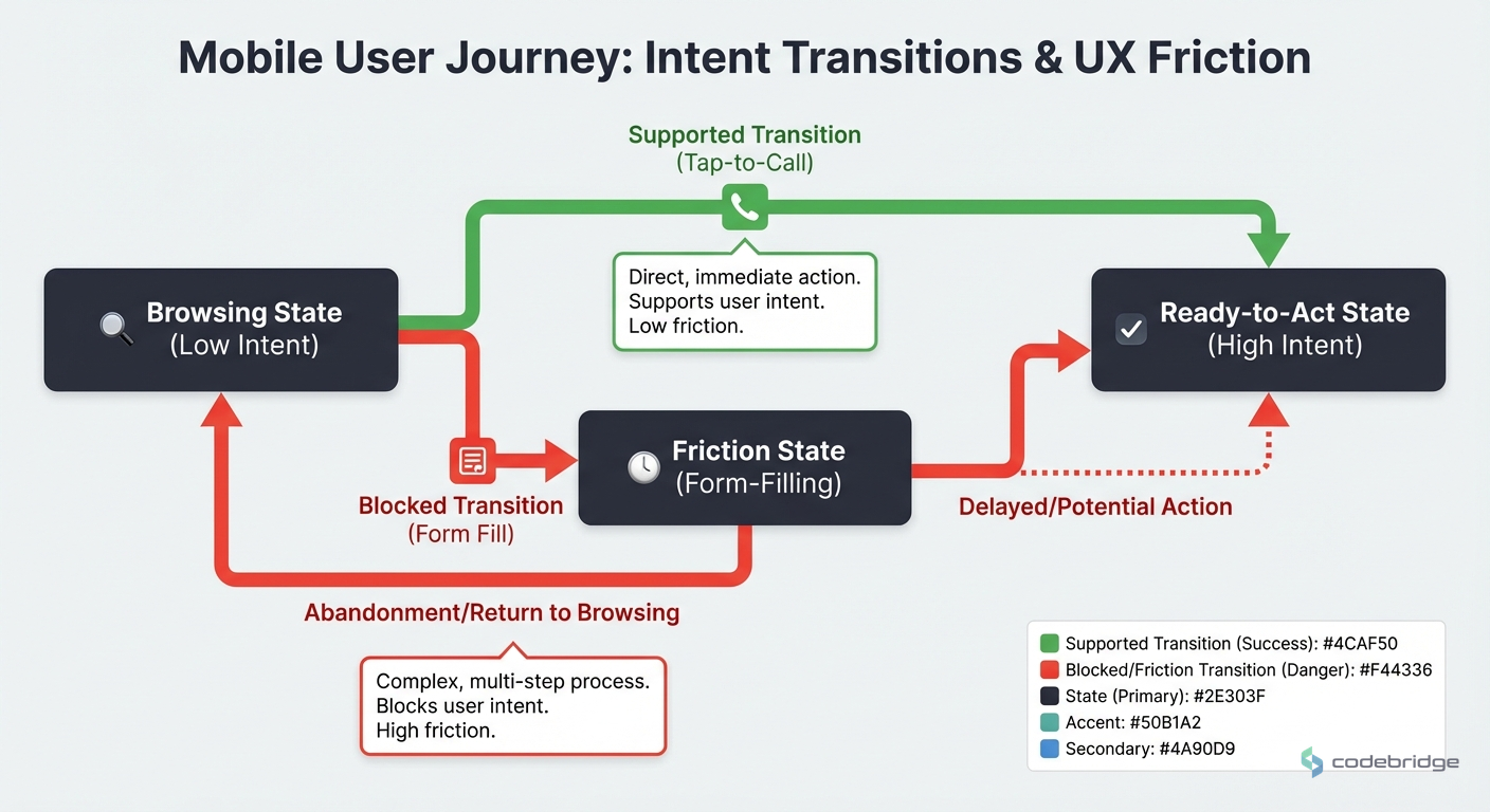
Why Your Mobile UX Is Fighting Against User Behavior
The conventional wisdom says mobile users are "just browsing",that they'll convert later on desktop. The data tells a different story. 38% of real estate conversions come from phone interactions, and 75.4% of users who click ads prefer to convert via phone call rather than form submission.
Your mobile users aren't "just browsing." They're ready to act,but only if the action you're offering matches how they want to engage.
This creates a fundamental UX mismatch. Most property search apps optimize for form fills and account creation. But mobile users,thumb on screen, probably multitasking,want to tap and talk. When you force them through a desktop-designed funnel, you're not just creating friction. You're actively working against their intent.
What Top Performers Do Differently
Zillow and Realtor.com consistently achieve conversion rates exceeding 5%,more than double the industry average. When I analyzed what separates them from the pack, three patterns emerged.
Pattern 1: Phone-First Conversion Architecture
Top performers don't bury the call button three taps deep. They treat tap-to-call as a primary conversion action, not a fallback. This means prominent placement above the fold on listing pages, sticky call buttons during scroll, and intelligent routing that connects users to the right agent without friction.
The math supports this approach. If 75% of your ad clickers prefer phone conversion, every pixel of screen real estate dedicated to form fields instead of call prompts is working against your conversion rate.
Pattern 2: Speed as a Feature, Not a Metric
Mobile users on property search apps are often in-context,standing outside a building, sitting in a parked car, walking through a neighborhood. They need information fast, and they'll bounce if they don't get it.
The REACH by RentCafe case study illustrates this beautifully. By shifting from ILS to SEO-optimized, fast-loading pages, they dropped cost per lease from $1,005.45 to $87.55 across 34 companies and 261 properties in just three months. That's not just a cost reduction,it's evidence that speed and scannability directly impact conversion.
Pattern 3: Search Intent Matching
Here's a counter-intuitive insight: search ads have an 8.29% CTR in real estate, while display ads manage only 1.12%. Most teams interpret this as "spend more on search." But the smarter read is about intent architecture.
Users arriving from search have explicit intent,they typed what they want. Your mobile UX should honor that intent by getting them to relevant listings in as few taps as possible. Display traffic, by contrast, needs nurturing. These are different journeys requiring different UX patterns, but most apps treat all traffic identically.
The Five-Point Mobile Conversion Framework
Based on what's working for top performers, here's a practical framework for auditing and improving your mobile property search UX.
1. Audit Your Tap-to-Call Placement
Open your app on a phone. Find a listing. How many taps to reach a human? If it's more than two, you're losing conversions. The benchmark performers make calling a one-tap action from any listing view.
2. Measure Time-to-First-Relevant-Listing
From app open to seeing a listing that matches user intent,what's your time? Include load times, filter selections, and scroll depth. Top performers hit this in under 8 seconds. If you're above 15, your mobile experience is fighting user behavior.
3. Segment Your Traffic by Intent
Users from search ads need different UX than users from display campaigns. Build landing experiences that match intent signals. Search traffic should see listings immediately. Display traffic might need more context and education before the search interface.
4. Optimize for Thumb Zones
The bottom third of a mobile screen is where thumbs naturally rest. Your primary conversion actions,call, schedule tour, save listing,should live in this zone. If your most important CTAs require a thumb stretch to the top of the screen, you're adding friction.
5. Implement Progressive Disclosure
Mobile screens are small. Don't dump every listing detail on the first view. Show what matters for the decision at hand (photos, price, location, availability), and let users tap for more. This isn't hiding information,it's respecting the mobile context.

The Cost of Ignoring Mobile UX Debt
Let's talk numbers. With an average cost per lead of $212 in real estate B2C, every percentage point of conversion improvement has real dollar impact. If you're spending $50,000/month on acquisition and converting at 2.2% instead of 4.7% (the industry average across all channels), you're leaving roughly 1,100 leads on the table annually.
| Metric | Industry Average | Top Performers | Gap Impact |
|---|---|---|---|
| Mobile CVR | 2.49% | 5%+ | 2x conversion opportunity |
| Cost per Lead | $212 | ~$100 | 50% cost reduction potential |
| Phone Conversion Rate | Varies | 38% of total | Tap-to-call optimization ROI |
The REACH case study shows what's possible when you fix the fundamentals. A 90% reduction in cost per lease isn't magic,it's what happens when your mobile UX stops fighting user behavior and starts enabling it.
What This Means for Your 2026 Roadmap
Mobile-first optimization for property search isn't a nice-to-have anymore. With three-quarters of rental searches happening on mobile, it's the primary battleground for conversion optimization.
"The platforms winning in 2026 aren't the ones with the best features." They're the ones that removed the most friction between intent and action on mobile.
Industry observation, based on top performer analysis
The pattern is clear: phone-first conversion architecture, speed as a feature, and intent-matched UX. Teams that nail these three elements are hitting 5%+ conversion rates while the industry average languishes at 2.2%.
Remember my flatlined conversion rate from the opening? After implementing these patterns,especially moving tap-to-call above the fold and reducing time-to-first-listing,we saw mobile conversion climb from 2.1% to 3.8% over two quarters. Not industry-leading, but a 80% improvement that translated to real revenue. The gap between mobile and desktop still exists, but it's no longer a chasm.
Not sure where to start?
Audit your mobile conversion flow against these patterns and identify your biggest friction points.
Diagnostic Checklist: Is Your Mobile UX Bleeding Conversions?
Use this checklist to identify whether your property search app has UX debt that's costing you conversions.
Your mobile conversion rate is below the 2.49% mobile benchmark
Tap-to-call requires more than 2 taps from any listing view
Time-to-first-relevant-listing exceeds 15 seconds on mobile
Your primary CTAs are positioned in the top third of the screen (outside thumb zone)
You use the same landing experience for search and display traffic
Phone conversions represent less than 30% of your total conversions
Your cost per lead exceeds the $212 industry average
Mobile session duration is shorter than desktop without proportional conversion
Your listing pages show all details on first load rather than using progressive disclosure
If you checked three or more items, your mobile UX is likely working against user behavior rather than with it. Start with tap-to-call placement and time-to-first-listing,these two optimizations typically deliver the fastest ROI.

Heading 1
Heading 2
Heading 3
Heading 4
Heading 5
Heading 6
Lorem ipsum dolor sit amet, consectetur adipiscing elit, sed do eiusmod tempor incididunt ut labore et dolore magna aliqua. Ut enim ad minim veniam, quis nostrud exercitation ullamco laboris nisi ut aliquip ex ea commodo consequat. Duis aute irure dolor in reprehenderit in voluptate velit esse cillum dolore eu fugiat nulla pariatur.
Block quote
Ordered list
- Item 1
- Item 2
- Item 3
Unordered list
- Item A
- Item B
- Item C
Bold text
Emphasis
Superscript
Subscript


.avif)


.avif)

.avif)