


Designing a healthcare app involves more than just fulfilling business objectives; it must cater to the specific needs of users and demonstrate exceptional usability. In this article, drawing from our experience with the Healthier project, we provide proven tips for designing a healthcare app using a holistic approach. Let's dive into the essential considerations for healthcare app design.

1. Research
The design process begins with thorough research. This involves getting to know the stakeholders, eliciting requirements and business goals, understanding users' interests and needs, and shaping the benefits for users. The research phase is crucial for uncovering insights that inform the design process.
Key Activities in the Research Phase:
- Interviews with Stakeholders. Engage with stakeholders to understand their vision, goals, and expectations for the app.
- User Interviews. Conduct interviews with potential users to gain insights into their needs, preferences, and pain points.
- Competitor Analysis. Analyze competitors' apps to identify strengths, weaknesses, and opportunities for differentiation.
- Customer Journey Mapping. Map out the customer journey to understand how users interact with the app and identify areas for improvement.
During this phase, you may discover not-so-obvious pain points of your target audience that you wouldn't have thought of initially. These insights are invaluable for creating a user-centered design that meets real needs.
2. Navigation
The target audience of healthcare apps can be diverse, depending on the app's purpose. However, one constant is the need for simple navigation. Clear and intuitive navigation is essential for ensuring a positive user experience.
Tips for Effective Navigation:
- Simplify Interaction with Data. Use dashboards, visual elements, and animations to make data interaction straightforward and engaging.
- Thoughtful Onboarding. Streamline the onboarding process by asking only for essential personal data and guiding users through the app's features step-by-step.
- Balance Between Navigation and Aesthetics. Ensure that the user interface (UI) is aesthetically pleasing while maintaining ease of use.
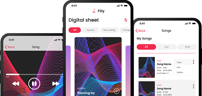
For example, in designing Healthier, a medical platform that connects patients and doctors, we aimed to create an attractive yet convenient design. We used a color palette that fits the medical theme, with a white background and blue elements, and added bright and warm tones to highlight important blocks. The Montserrat font was chosen for its formal yet modern and eye-friendly appearance.
3. UX Writing
Microcopy, or UX writing, is the language of an interface, encompassing buttons, notifications, statuses, and more. Effective UX writing is as important as the app's interface and features for conveying messages to users and guiding them through the app.
Best Practices for UX Writing in Healthcare Apps:
- Use Simple Language. Avoid medical jargon and complex terms if the app is aimed at a broad audience without a professional medical background.
- Clarity and Guidance. Ensure that microcopy clearly communicates the app's purpose, values, and how users can achieve their goals.
- Reassurance. Use reassuring language to prevent users from feeling overwhelmed or alarmed by medical terms.
When writing for a healthcare app, the goal is to speak to your audience in a way that is easily understandable and supportive. This helps users feel more comfortable and confident in using the app.
4. Visualize the Data
The adage "Tell me, and I forget. Teach me, and I remember. Involve me, and I learn" underscores the importance of data visualization. Visual elements can significantly enhance the user's understanding and engagement with the app.
Effective Data Visualization Techniques:
- Illustrations and Animations. Use illustrations and animations to make complex information more digestible and engaging.
- Dashboards. Implement dashboards to provide users with a clear overview of their health data.
- Interactive Elements. Incorporate interactive elements that allow users to explore and understand their health metrics dynamically.
In healthcare apps, where users often need to track health metrics like blood pressure, heartbeat, and weight, visual representations can be far more effective than lengthy descriptions. By visualizing data, you make it easier for users to understand and manage their health.
5. Inclusive Design
Inclusive design ensures that your app is accessible to all users, including those with disabilities. This approach not only broadens your user base but also demonstrates a commitment to user-centered design principles.
Key Elements of Inclusive Design:
- Readable Content. Ensure that content is readable and compatible with screen readers.
- Subtitles and Descriptions. Provide subtitles for videos and brief descriptions for images and audio files.
- Adjustable UI Elements. Allow users to adjust font sizes, button sizes, and other navigation elements.
- Gender-Free and Non-Biased Microcopy. Use inclusive language that avoids bias and is respectful of all users.
Inclusive design is not just about accessibility; it's about creating a user experience that is equitable and respectful of all users. By incorporating these principles, you can ensure that your app is usable and beneficial to a diverse audience.
Designing a healthcare app requires a thorough analysis of the target audience to understand their needs and pain points, coupled with inclusive design principles to ensure accessibility for all users.
Conclusion
Designing a healthcare app requires a thorough analysis of the target audience to understand their needs and pain points. Moreover, healthcare apps demand the use of inclusive design guidelines to embrace the majority of target users. By following these guidelines, you can create an app that not only meets business goals but also provides an exceptional user experience.
If you have an idea for a healthcare application, drop us a line to discuss its implementation and design. Our experience with projects like Healthier ensures that we can help you create a successful and user-friendly healthcare app. With a focus on research, navigation, UX writing, data visualization, and inclusive design, we are committed to delivering apps that make a positive impact on users' lives.
By considering these essential aspects of healthcare app design, you can create a product that stands out in a competitive market and provides real value to your users. Remember, the success of a healthcare app hinges on its ability to meet user needs effectively and inclusively. Invest the time and effort into understanding your users and crafting a design that truly serves them.
FAQ
What makes UI/UX design for healthcare applications unique?
Healthcare apps must prioritize clarity, accuracy, and trust while handling sensitive data. Designs need to support diverse users, including patients, clinicians, and caregivers, often in high-stress situations.
Why is usability critical in healthcare UI/UX design?
Poor usability can lead to misunderstandings or errors that affect patient outcomes. Intuitive navigation and clear information presentation help users complete tasks safely and confidently.
How should designers approach user research for healthcare apps?
Designers should involve real users, understand clinical workflows, and consider regulatory constraints. Research should capture both functional needs and emotional contexts.
What accessibility considerations are essential in healthcare app design?
Healthcare apps should support readable typography, sufficient color contrast, voice assistance, and compatibility with assistive technologies to accommodate diverse abilities.
How do security and privacy influence UI/UX decisions?
Security features such as authentication and consent must be strong yet unobtrusive. Clear messaging builds trust without overwhelming users with complexity.
How can healthcare UI/UX designs be validated before launch?
Usability testing, compliance checks, and iterative prototyping help identify risks early. Testing with representative users ensures the design supports safe and effective care.


Heading 1
Heading 2
Heading 3
Heading 4
Heading 5
Heading 6
Lorem ipsum dolor sit amet, consectetur adipiscing elit, sed do eiusmod tempor incididunt ut labore et dolore magna aliqua. Ut enim ad minim veniam, quis nostrud exercitation ullamco laboris nisi ut aliquip ex ea commodo consequat. Duis aute irure dolor in reprehenderit in voluptate velit esse cillum dolore eu fugiat nulla pariatur.
Block quote
Ordered list
- Item 1
- Item 2
- Item 3
Unordered list
- Item A
- Item B
- Item C
Bold text
Emphasis
Superscript
Subscript