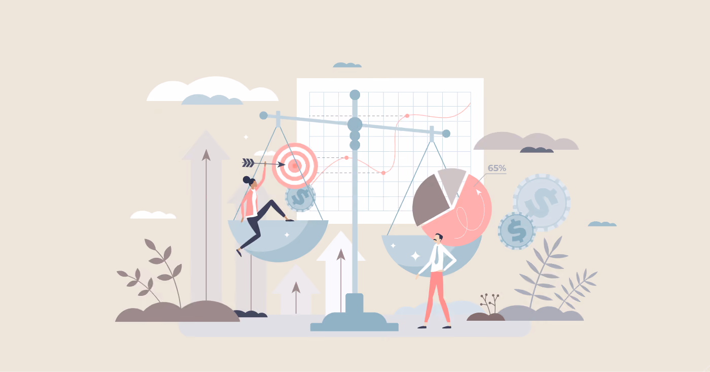
With this question, a visual hierarchy will help us — the arrangement of graphic elements in a design in order of importance of each component. The visual weight defines the significance of a part in a design’s hierarchy, communicating to a viewer’s eyes what to focus on and in what order.
We found TOP-6 necessary steps, following which you’ll get the best design!

1. Size Matters
Bigger Means More Important
In design, size plays a crucial role in establishing visual hierarchy. Larger elements naturally draw more attention and are perceived as more important than smaller ones. This principle is grounded in our instinctive reading patterns, where we tend to focus first on larger, more prominent elements. For example, headlines and key visuals should be significantly larger than body text to ensure they capture the viewer’s initial focus. Implementing this principle effectively helps prioritize the most critical information in your design.
2. Reading Patterns: Z-patterns and F-patterns
Z-Pattern for Ads and Websites
The Z-pattern is a common visual reading pattern used in designs where information is presented in non-linear formats, such as advertisements or landing pages. This pattern follows a diagonal path from the top-left corner of the page, moving across to the top-right, then diagonally down to the bottom-left, and finally ending at the bottom-right. This approach helps in placing key elements along this path to ensure they are seen by viewers as they scan the page.
F-Pattern for Text-Heavy Pages
The F-pattern is prevalent in content-rich designs like articles and blog posts. In this pattern, users read the text starting from the top-left corner, moving horizontally to the right before moving down the page and repeating this left-to-right pattern. This pattern resembles an “F” shape and indicates that the most critical information should be placed along these reading paths to maximize visibility and engagement.
3. Direction: Breaking the Grid
Using Curves and Diagonals
While traditional design often adheres to a strict grid of vertical and horizontal lines, deviating from this grid can create a focal point. Arranging text or elements on a curve or diagonal can make them stand out from the surrounding content, drawing the viewer's eye to these unique design features. This technique can be particularly effective in emphasizing key messages or calls to action.
4. Typeface Weight and Pairing
Font Attributes
The typeface used in your design significantly impacts visual hierarchy. Key attributes include:
- Weight: The thickness of the strokes in a typeface. Heavier fonts (bold or semi-bold) generally attract more attention than lighter fonts.
- Style: Serif fonts often convey formality and elegance, while sans-serif fonts are typically seen as modern and clean. Choosing the right style enhances the message you want to convey.
- Modifications: Italicization and other font variations can further differentiate important text and guide the viewer’s focus.
Effective font pairing involves using contrasting weights and styles to establish a clear hierarchy. For example, a bold headline paired with a lighter body text creates a visual distinction that guides the viewer’s attention from the headline to the supporting content.
5. Color and Tint
Using Color to Prioritize
Color is a powerful tool in visual hierarchy. Bright and vibrant colors naturally draw more attention than muted or grayscale tones. Additionally, darker and richer colors typically appear closer or more prominent, while lighter tints seem more distant. By strategically using color to highlight important elements, you can direct the viewer's focus and reinforce the hierarchy of information.
6. Space and Texture
Creating Breathing Room
Adequate spacing around elements is crucial for effective visual hierarchy. White space, or negative space, provides visual relief and helps viewers process information without feeling overwhelmed. A cluttered design with insufficient spacing can make it difficult for users to identify and focus on key elements. Texture, too, can enhance visual hierarchy by adding depth and dimension, further distinguishing between different content areas.
Understanding and applying visual hierarchy is key to creating designs that effectively communicate and captivate. By strategically using elements like size, color, and spacing, you can guide viewers' attention and deliver your message with impact.
Summing Up
Mastering visual hierarchy involves understanding how size, reading patterns, direction, typeface, color, and space interact to guide a viewer's focus and comprehension. By applying these principles thoughtfully, you can create designs that not only look aesthetically pleasing but also effectively communicate key messages and enhance user experience. Whether you’re designing a website, ad, or any other visual content, keeping these hierarchy strategies in mind will help you achieve clarity and impact in your designs.
FAQ
What makes a design both catchy and harmonious?
A catchy and harmonious design balances visual appeal with consistency. It uses color, typography, spacing, and layout thoughtfully to attract attention while maintaining clarity and coherence.
How does color harmony affect the overall design?
Color harmony creates visual balance and emotional consistency. Well-matched color palettes guide attention, reinforce brand identity, and prevent visual overload.
Why is visual hierarchy important for harmonious design?
Visual hierarchy helps users understand content structure at a glance. By prioritizing elements through size, contrast, and placement, designers create flow and reduce confusion.
How can typography enhance both readability and style?
Choosing complementary typefaces and maintaining consistent font sizes and spacing improves readability while adding personality and polish to the design.
What role does white space play in creating harmony?
White space improves focus and readability by separating elements and reducing clutter. It allows key content to stand out and creates a more elegant, balanced layout.
How can designers test whether a design feels harmonious?
Designers can test harmony through usability testing, visual audits, and user feedback. Stepping back, reviewing designs across devices, and iterating based on insights help refine balance and appeal.


Heading 1
Heading 2
Heading 3
Heading 4
Heading 5
Heading 6
Lorem ipsum dolor sit amet, consectetur adipiscing elit, sed do eiusmod tempor incididunt ut labore et dolore magna aliqua. Ut enim ad minim veniam, quis nostrud exercitation ullamco laboris nisi ut aliquip ex ea commodo consequat. Duis aute irure dolor in reprehenderit in voluptate velit esse cillum dolore eu fugiat nulla pariatur.
Block quote
Ordered list
- Item 1
- Item 2
- Item 3
Unordered list
- Item A
- Item B
- Item C
Bold text
Emphasis
Superscript
Subscript