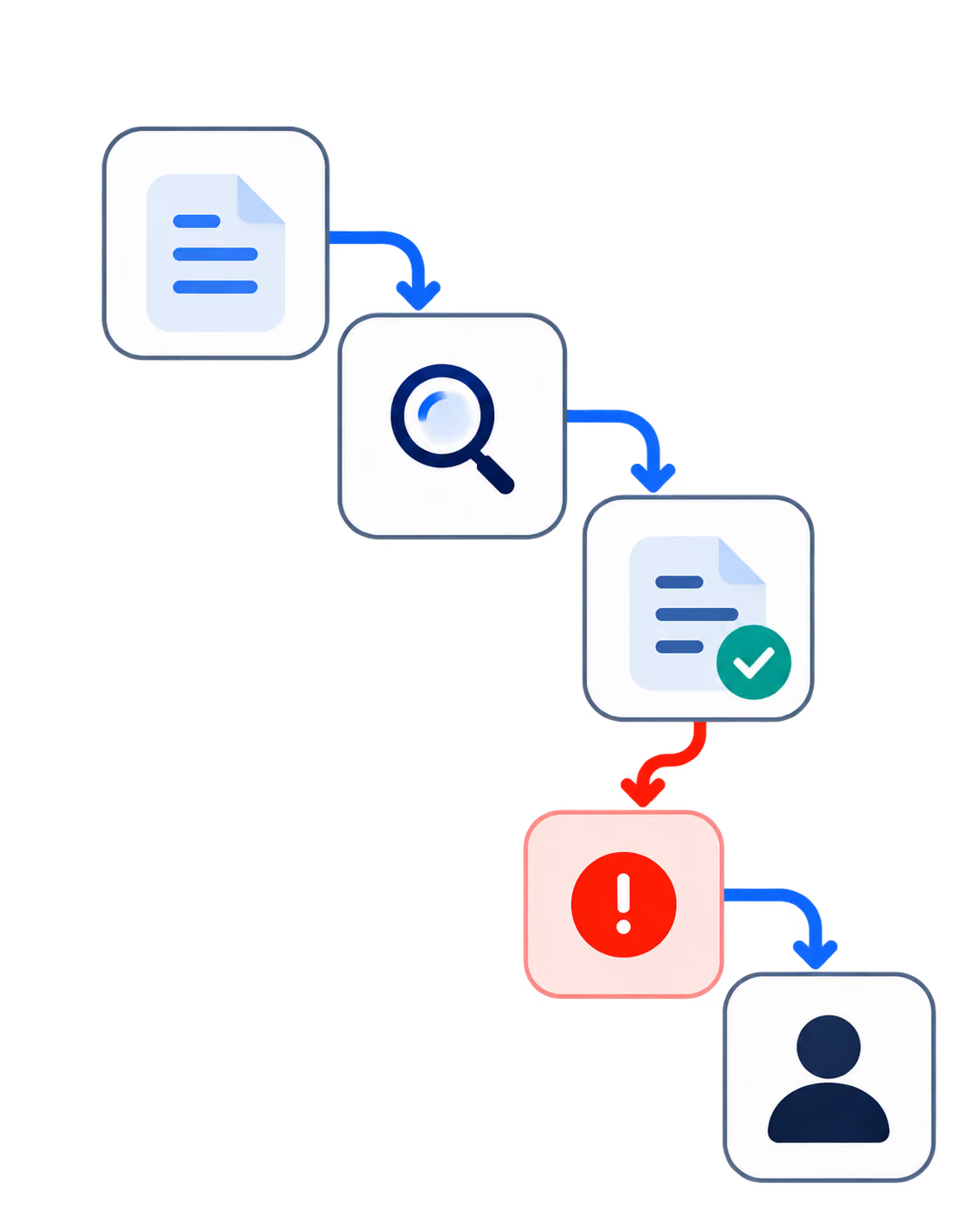
In today's digital landscape, where user attention is fleeting and competition is fierce, the importance of intuitive UI (User Interface) design in driving conversions cannot be overstated. Conversion rate—the percentage of users who take a desired action, such as making a purchase or signing up for a newsletter — is a key metric for any online business. An intuitive UI design ensures that users can easily navigate a website or app, find what they're looking for, and complete their goals without friction. This article will explore the essential strategies for improving conversion rates through intuitive UI design, offering practical tips and insights for businesses looking to optimize their digital experiences.
1. Understand Your Users: The Foundation of Intuitive Design
Before diving into specific design strategies, it's crucial to understand that an intuitive UI design is rooted in a deep understanding of the users. Knowing your audience—who they are, what they want, and how they interact with your product—is the foundation of creating a user interface that feels natural and effortless.
Conduct User Research
User research is the first step in understanding your audience. This can involve a variety of methods, including surveys, interviews, and usability testing. The goal is to gather insights into your users' behaviors, needs, and pain points. By understanding what drives your users and what frustrates them, you can design an interface that meets their expectations and reduces the likelihood of them abandoning the process before converting.
Develop User Personas
Once you've gathered data from user research, the next step is to create user personas—detailed representations of your typical users. These personas should include demographic information, user goals, challenges, and preferred ways of interacting with digital products. By keeping these personas in mind throughout the design process, you can ensure that your UI is tailored to the specific needs of your target audience.

2. Simplify Navigation: Guiding Users Seamlessly
One of the most significant factors influencing user experience and conversion rates is navigation. If users cannot easily find what they're looking for, they are likely to leave your site or app and look for alternatives. Simplifying navigation is, therefore, critical to improving conversion rates.
Use a Clear and Consistent Menu Structure
Your menu is the roadmap for your users. It should be organized logically, with clear labels that accurately describe the content or actions associated with each item. Avoid using jargon or overly creative language that might confuse users. Additionally, the menu should be consistent across all pages, so users always know where to find the information they need.

Implement Breadcrumbs
Breadcrumbs — navigational aids that show users their current location within a site's hierarchy — can greatly enhance navigation, especially on content-heavy sites. They allow users to easily backtrack to previous pages without having to start over, which can reduce frustration and keep users engaged.

Prioritize Mobile Navigation
With an increasing number of users accessing websites via mobile devices, optimizing navigation for smaller screens is essential. Use responsive design principles to ensure that menus and navigation elements are accessible and easy to use on all device types. A common approach is to implement a hamburger menu for mobile navigation, which conserves screen space while providing users with quick access to all essential features.

3. Focus on Visual Hierarchy: Leading Users to Action
Visual hierarchy is a critical aspect of UI design that influences how users interact with your content. By strategically organizing and prioritizing elements on the page, you can guide users' attention to the most important areas and encourage them to take desired actions.
Use Contrast to Highlight Key Elements
Contrast can be used to draw attention to specific elements, such as call-to-action (CTA) buttons, headlines, and important information. This can be achieved through the use of color, size, and spacing. For instance, a brightly colored CTA button on a neutral background is more likely to catch the user's eye and prompt a click.
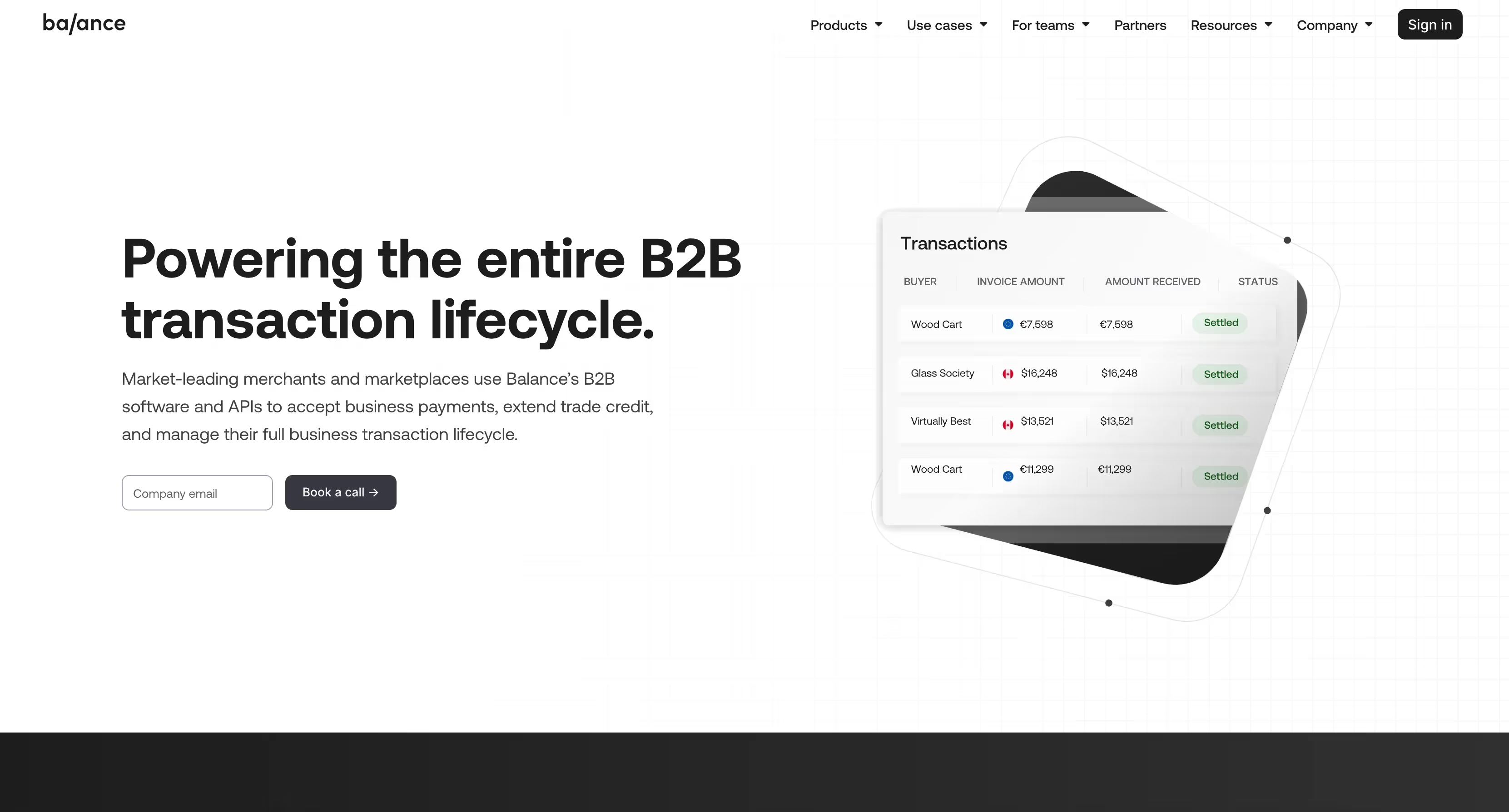
Apply the F-Pattern and Z-Pattern Layouts
Research has shown that users often scan web pages in an F-pattern (for content-heavy pages) or Z-pattern (for pages with minimal text and prominent visual elements). These patterns can inform the placement of key content and CTAs. For example, placing the most important information along the top and left side of the page, where users typically start scanning, can increase the likelihood of it being seen.

Leverage White Space for Clarity
White space, or negative space, refers to the empty areas around elements on a page. It helps to create a clean, uncluttered interface and allows users to focus on the content that matters. By using white space effectively, you can prevent your design from feeling overwhelming and make it easier for users to process information and take action.

4. Optimize CTAs: Encouraging Users to Convert
Call-to-action buttons are a key driver of conversions, so optimizing their design and placement is crucial. An effective CTA button is one that is easily noticeable, clearly communicates the desired action, and is placed in a location that aligns with the user's journey.
Design CTAs that Stand Out
CTAs should be visually distinct from other elements on the page. This can be achieved through the use of contrasting colors, bold typography, and strategic placement. However, be careful not to overdo it; too many competing CTAs can dilute their effectiveness. It's often best to have one primary CTA per page, supported by secondary actions as needed.

Use Action-Oriented Language
The language used in your CTAs should be clear, concise, and action-oriented. Phrases like "Get Started," "Sign Up Now," or "Buy Today" create a sense of urgency and clearly convey what the user can expect when they click the button. Avoid vague language like "Click Here," which doesn't provide any context for the action.
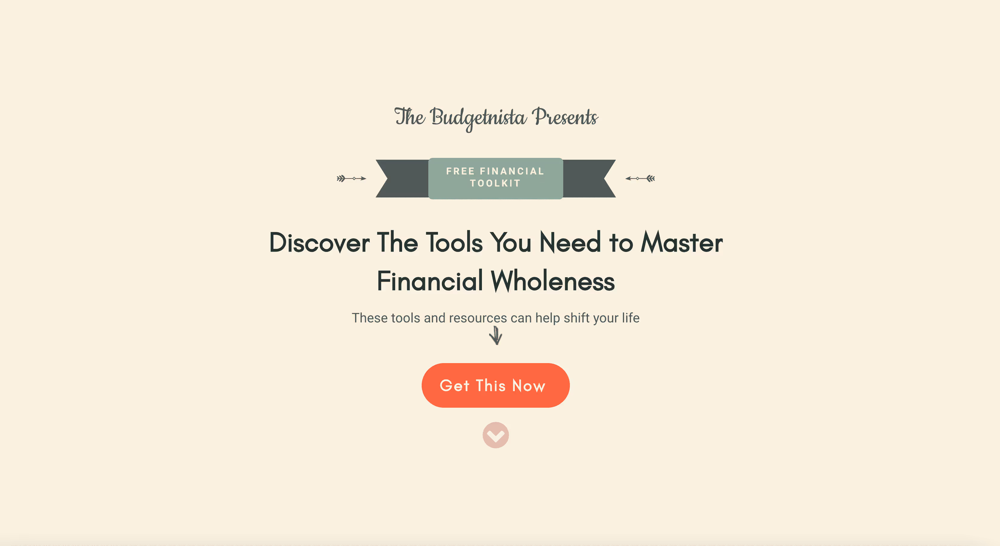
Place CTAs Strategically
The placement of your CTAs can significantly impact their effectiveness. CTAs should be placed where users are most likely to take action, such as at the end of a product description, after a compelling piece of content, or in the user's direct line of sight when they first land on a page. Additionally, consider adding CTAs in multiple locations on longer pages, so users don't have to scroll back up or down to find them.

5. Reduce Friction: Making the Conversion Process Seamless
Friction refers to any obstacles or difficulties that users encounter when trying to complete a desired action. Reducing friction is essential for improving conversion rates, as users are more likely to abandon the process if they encounter too many hurdles.
Simplify Forms
Forms are often a necessary part of the conversion process, whether it's for signing up, making a purchase, or requesting more information. However, long or complicated forms can deter users. To reduce friction, keep forms as short as possible, only asking for the information you absolutely need. Use clear labels, provide helpful error messages, and consider using autofill or input masking to make the process easier for users.

Optimize Load Times
Slow-loading pages are a significant source of friction and can lead to higher bounce rates. Users expect fast, responsive websites, and even a delay of a few seconds can result in lost conversions. To optimize load times, compress images, leverage browser caching, and minimize the use of heavy scripts and plugins. Tools like Google PageSpeed Insights can help you identify areas for improvement.

Offer Guest Checkout Options
For e-commerce sites, requiring users to create an account before making a purchase can be a significant barrier to conversion. Offering a guest checkout option allows users to complete their purchase quickly without the hassle of setting up an account. If account creation is important to your business model, consider asking users to create an account after they've made their purchase, rather than before.

6. Test and Iterate: Continuously Improving Your UI Design
UI design is not a one-time effort; it requires continuous testing, feedback, and iteration to ensure it remains effective in driving conversions. By regularly testing different design elements and making data-driven adjustments, you can optimize your UI for better performance over time.
A/B Testing
A/B testing involves creating two versions of a page or element and testing them with different segments of your audience to see which performs better. This method is particularly useful for testing CTAs, headlines, form layouts, and other key components of your UI. By analyzing the results, you can make informed decisions about which design elements are most effective at driving conversions.

Heatmaps and User Behavior Analytics
Heatmaps and user behavior analytics tools, such as Hotjar or Crazy Egg, provide visual insights into how users interact with your website. Heatmaps show where users are clicking, scrolling, and spending the most time, allowing you to identify areas of your UI that may be causing confusion or friction. User session recordings can also reveal common pain points, helping you to make targeted improvements.

Gather User Feedback
User feedback is invaluable for understanding how real users perceive and interact with your UI. This can be gathered through surveys, usability tests, or direct feedback channels. Pay close attention to any recurring issues or suggestions, and use this feedback to inform your design iterations.

An intuitive UI design is the silent engine behind high conversion rates, guiding users effortlessly from interest to action.
Conclusion
Improving conversion rates through intuitive UI design is a multifaceted process that requires a deep understanding of your users, careful attention to design details, and a commitment to continuous improvement. By focusing on user-centered design principles, simplifying navigation, optimizing CTAs, reducing friction, and regularly testing and iterating, businesses can create digital experiences that not only attract users but also convert them into loyal customers. In a competitive digital landscape, an intuitive UI design is not just a nice-to-have—it's a critical component of your business's success.
FAQ
What is intuitive UI design?
Intuitive UI design focuses on creating interfaces that feel natural and easy to use without requiring instructions. It aligns with user expectations and reduces effort, helping users complete actions smoothly.
How does intuitive UI design impact conversion rates?
When users can navigate and understand an interface quickly, friction is reduced. This leads to higher engagement, fewer drop-offs, and increased conversion rates across key user flows.
Which UI elements have the biggest influence on conversions?
Elements such as clear calls-to-action, simple navigation, visual hierarchy, form design, and responsive layouts significantly affect how users interact and convert.
How does reducing cognitive load improve conversions?
Reducing cognitive load minimizes the mental effort required to make decisions. Clear content structure, familiar patterns, and minimal distractions help users move confidently toward conversion.
What role does usability testing play in optimizing conversions?
Usability testing reveals where users struggle or abandon flows. Insights from testing help teams refine layouts, messaging, and interactions to improve conversion performance.
How can UI design be continuously optimized for better results?
Continuous optimization involves A/B testing, analyzing user behavior, collecting feedback, and iterating on design changes. Data-driven improvements ensure sustained conversion growth.












Heading 1
Heading 2
Heading 3
Heading 4
Heading 5
Heading 6
Lorem ipsum dolor sit amet, consectetur adipiscing elit, sed do eiusmod tempor incididunt ut labore et dolore magna aliqua. Ut enim ad minim veniam, quis nostrud exercitation ullamco laboris nisi ut aliquip ex ea commodo consequat. Duis aute irure dolor in reprehenderit in voluptate velit esse cillum dolore eu fugiat nulla pariatur.
Block quote
Ordered list
- Item 1
- Item 2
- Item 3
Unordered list
- Item A
- Item B
- Item C
Bold text
Emphasis
Superscript
Subscript