


While working on a UI, we needed to add a line separator between two sections. Here it is:

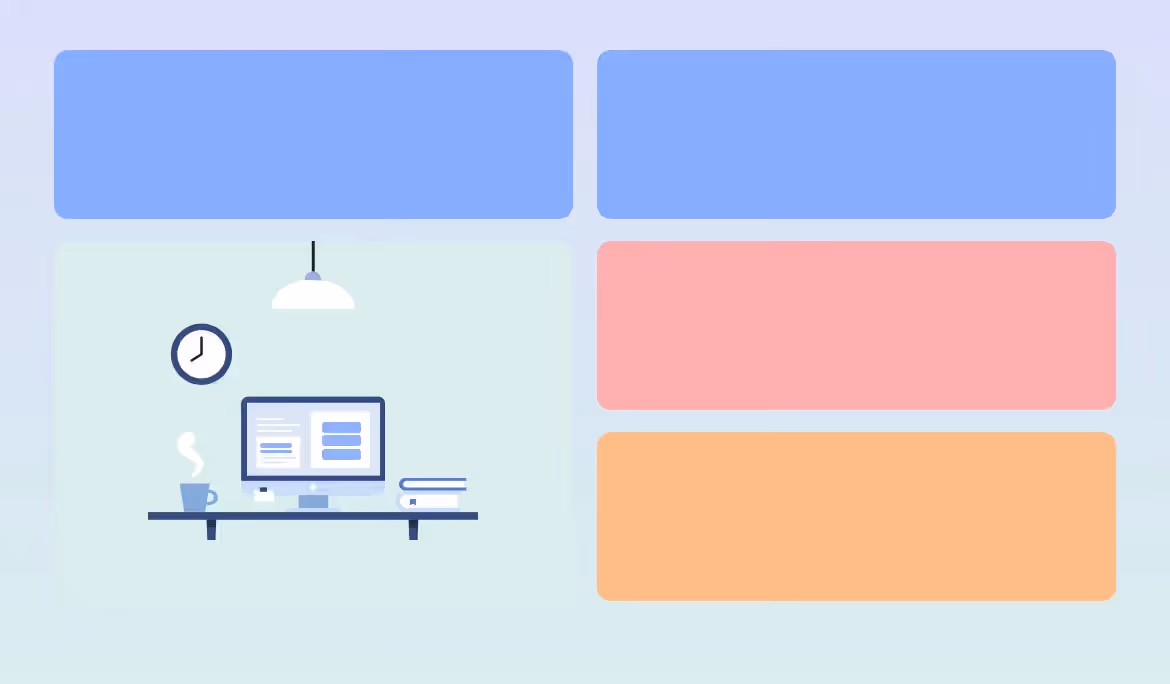
On smaller viewports, the line will become horizontal:

Let’s take a look at the HTML.

We have a section, with two main child items. Between them, we will have a line separator.
In CSS, we will use flexbox to handle the layout.

We added a 1rem gap between each one, and also each child item should fill 50% of its parent. Here is the result:
Next step, we want to center the two items vertically, so we will use align-items on the parent.

Now the two items are centered (we added the red line to make it easy to spot that). You might be asking, what does that have to do with the separator?

Adding The Separator
We wanted to add this as a pseudo-element, so we wrote this CSS. Can you expect the visual result of this without scrolling down?

Oh, what is that little square doing over here? Since the pseudo-element is only a 1px border from all sides, the result will be 2*2` square.

Let’s focus a bit here. This is the core of this little CSS trick.
The square comes from using the same color for each border. With different colors, it can look like this.

Why the Separator Looks Like a Square?
Since we added align-items: center to center the child items vertically, we removed the default behavior of flexbox stretching child items (stretching vertically, in this case).
Now it looks like the following visual:

Next, we need to reorder the flex items to make the divider appears between them.

And we’re done!

To make this work on all screen sizes, we need to have the flex-direction: column mobile and flex-direction: row for larger screens.

Here is a video of changing the flex-direction. Notice how the separator changes!
This works like magic because it’s a flexbox behavior.
When flex-direction: row is set, the cross-axis is vertical thus the pseudo-element stretches vertically.

And when the cross-axis is set to flex-direction: column, it will be horizontal and so the pseudo-element stretches horizontally.

Isn’t that neat? No need to use width, height, or anything else! It’s just a border being stretching via flexbox.
The Separator Thickness
Since the border value contributes to the four directions, we need to use 0.5x of the thickness we want. For example, if we want a 1px separator, then the border should be like the following:

Gradient Separators
This is another reason for us to pick the border solution above others. We can use gradients via border-image.


Dashed Separators
Given that we’re using borders, we can also have a dashed separator.


Another Way of Doing It
If we haven’t taken the time to think about implementing this, then we might have used width and height. We are not saying the following is a bad solution, but it’s good to step out of solutions we took for granted and think of other ways of solving UI problems.

Source: https://ishadeed.com/
FAQ
What is a dynamic line separator in a Flexbox layout?
A dynamic line separator is a visual divider (such as a line or space) that adapts automatically within a Flexbox container, resizing or repositioning itself based on available space and content.
Why use Flexbox for creating line separators?
Flexbox allows separators to align, stretch, and respond fluidly to layout changes without hardcoded widths or heights, making designs more responsive and maintainable.
How can a line separator automatically fill available space in Flexbox?
This is typically achieved by setting the separator element’s flex-grow property, allowing it to expand and fill remaining space between other flex items.
What are common use cases for dynamic separators in Flexbox layouts?
They are often used in headers, navigation bars, list items, breadcrumbs, and form layouts to visually separate content while maintaining responsive behavior.
How does Flexbox handle separators in horizontal vs. vertical layouts?
In horizontal layouts, separators usually grow in width, while in vertical layouts they grow in height. This behavior depends on the flex-direction setting of the container.
What mistakes should be avoided when implementing Flexbox separators?
Common mistakes include using fixed dimensions, ignoring alignment properties, and overcomplicating the layout with extra wrappers instead of leveraging Flexbox’s native capabilities.


Heading 1
Heading 2
Heading 3
Heading 4
Heading 5
Heading 6
Lorem ipsum dolor sit amet, consectetur adipiscing elit, sed do eiusmod tempor incididunt ut labore et dolore magna aliqua. Ut enim ad minim veniam, quis nostrud exercitation ullamco laboris nisi ut aliquip ex ea commodo consequat. Duis aute irure dolor in reprehenderit in voluptate velit esse cillum dolore eu fugiat nulla pariatur.
Block quote
Ordered list
- Item 1
- Item 2
- Item 3
Unordered list
- Item A
- Item B
- Item C
Bold text
Emphasis
Superscript
Subscript


